Category: Reviews

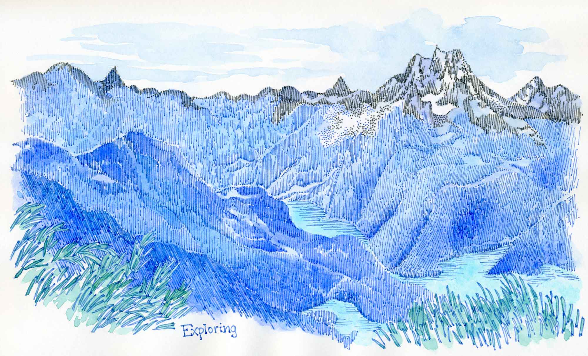
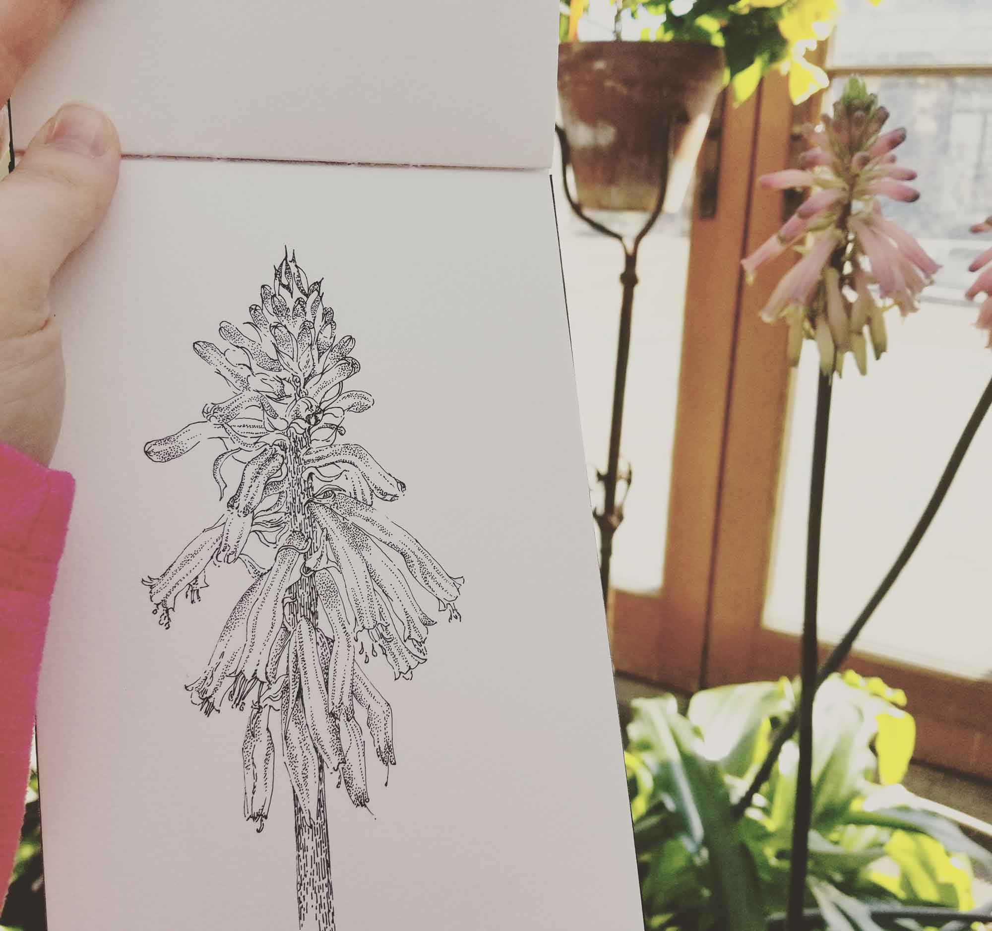
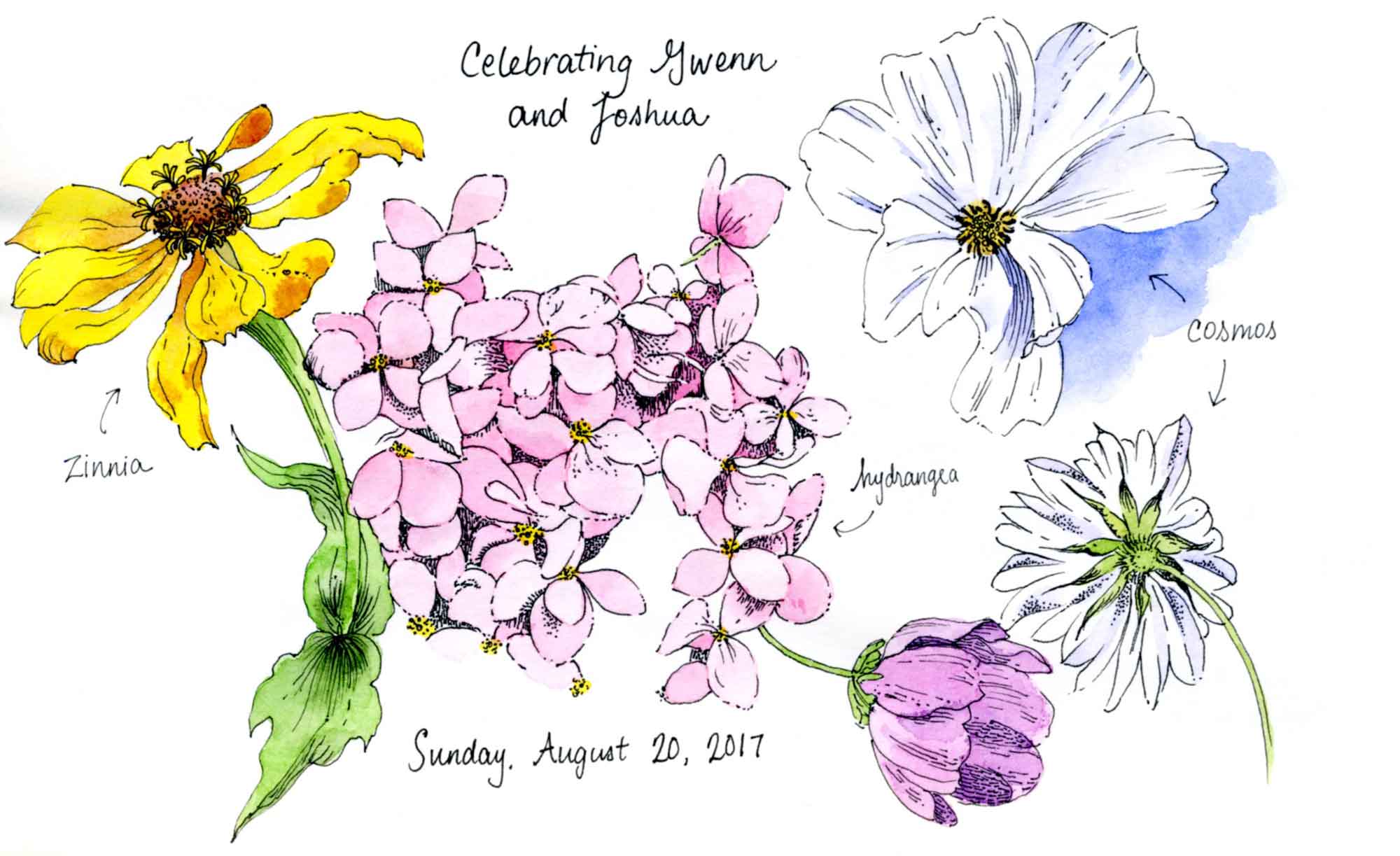
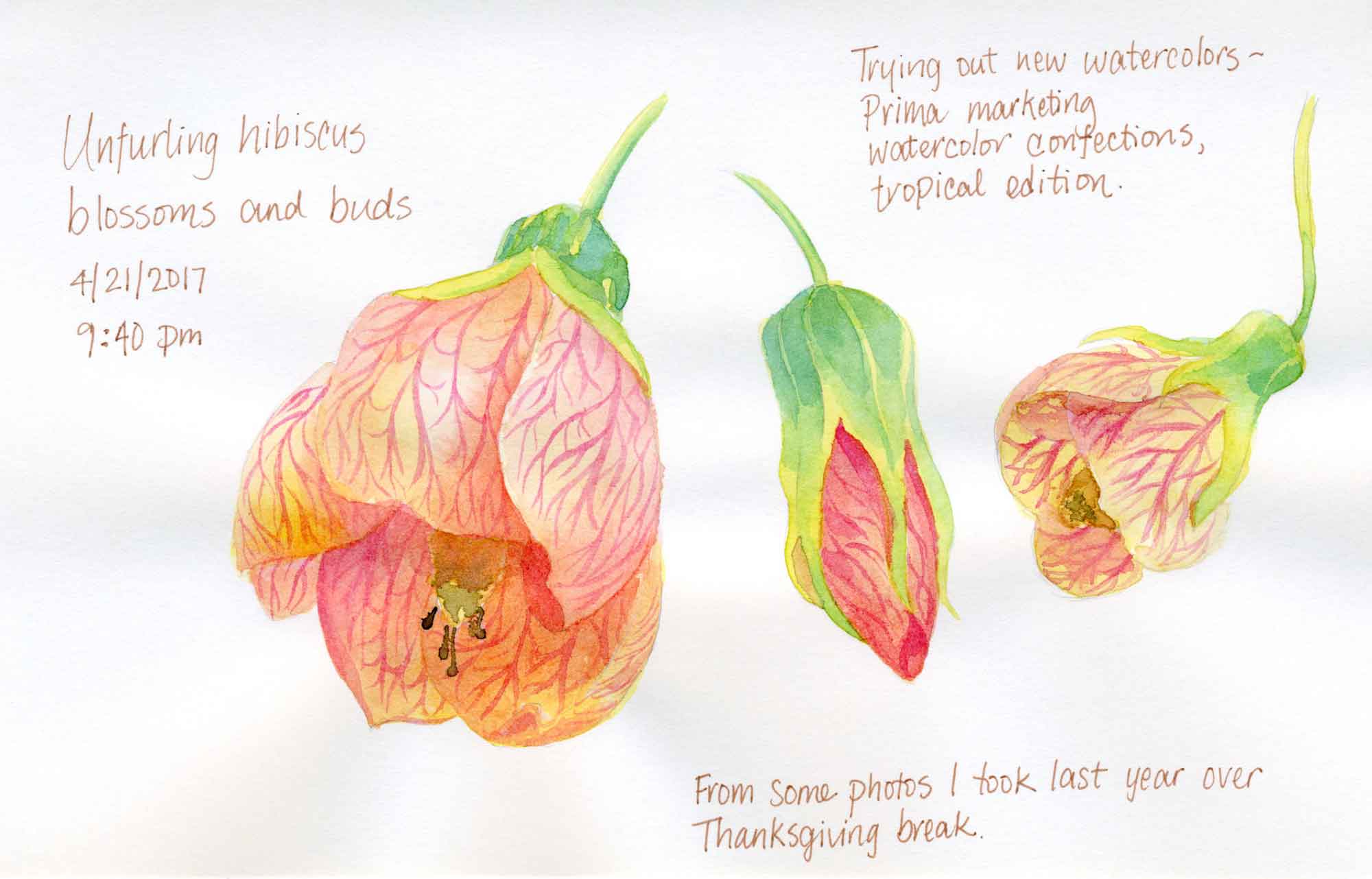
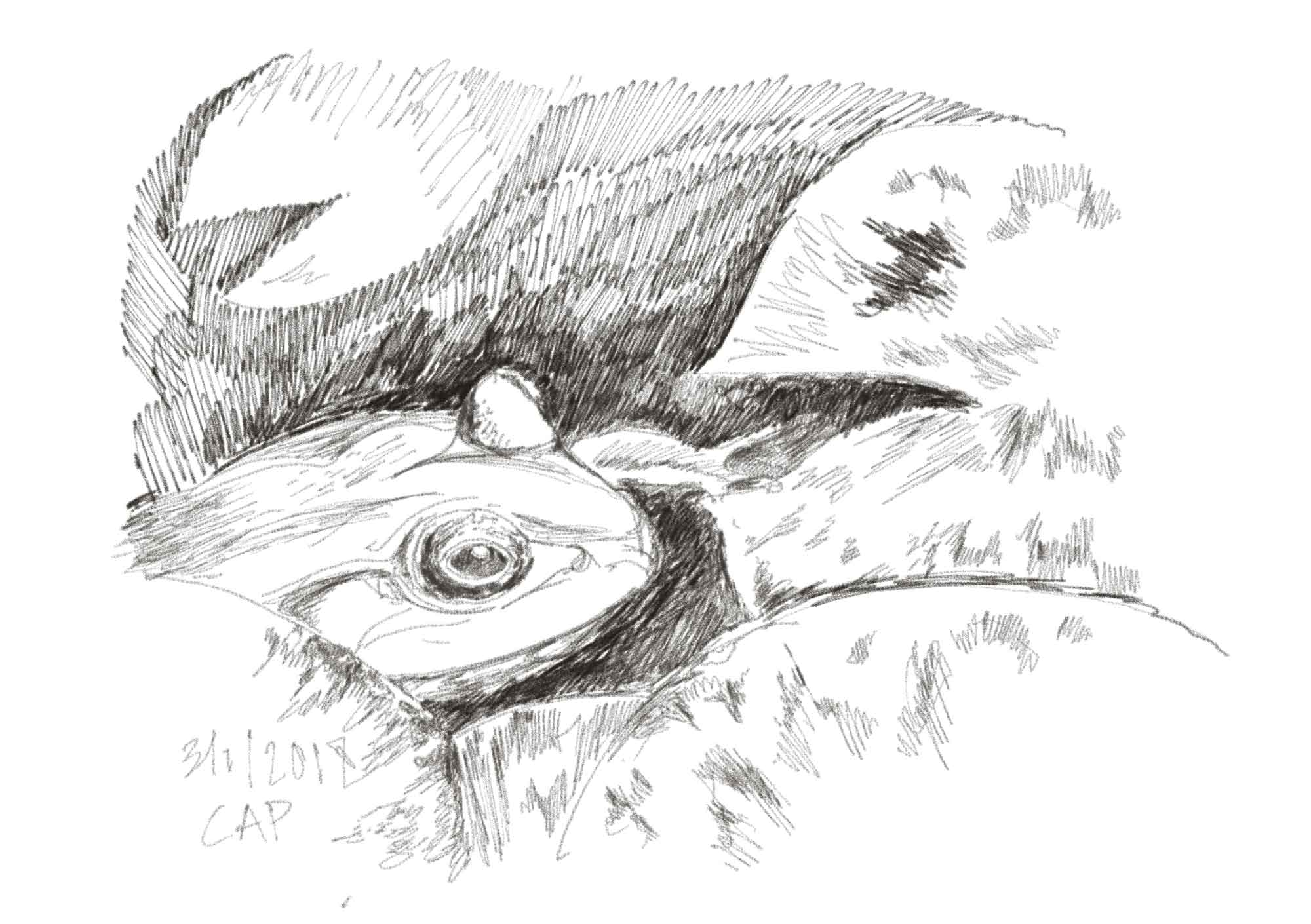
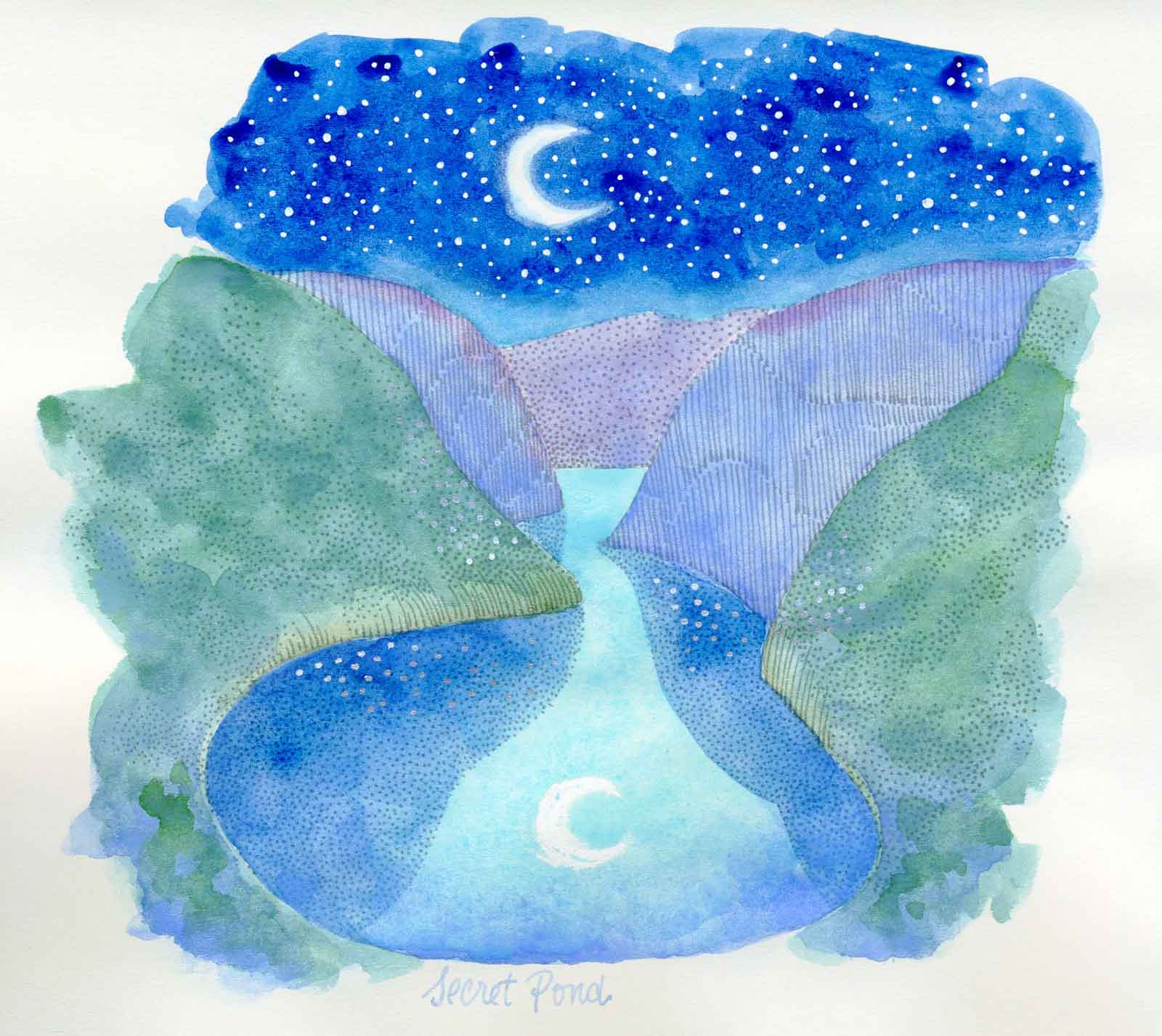
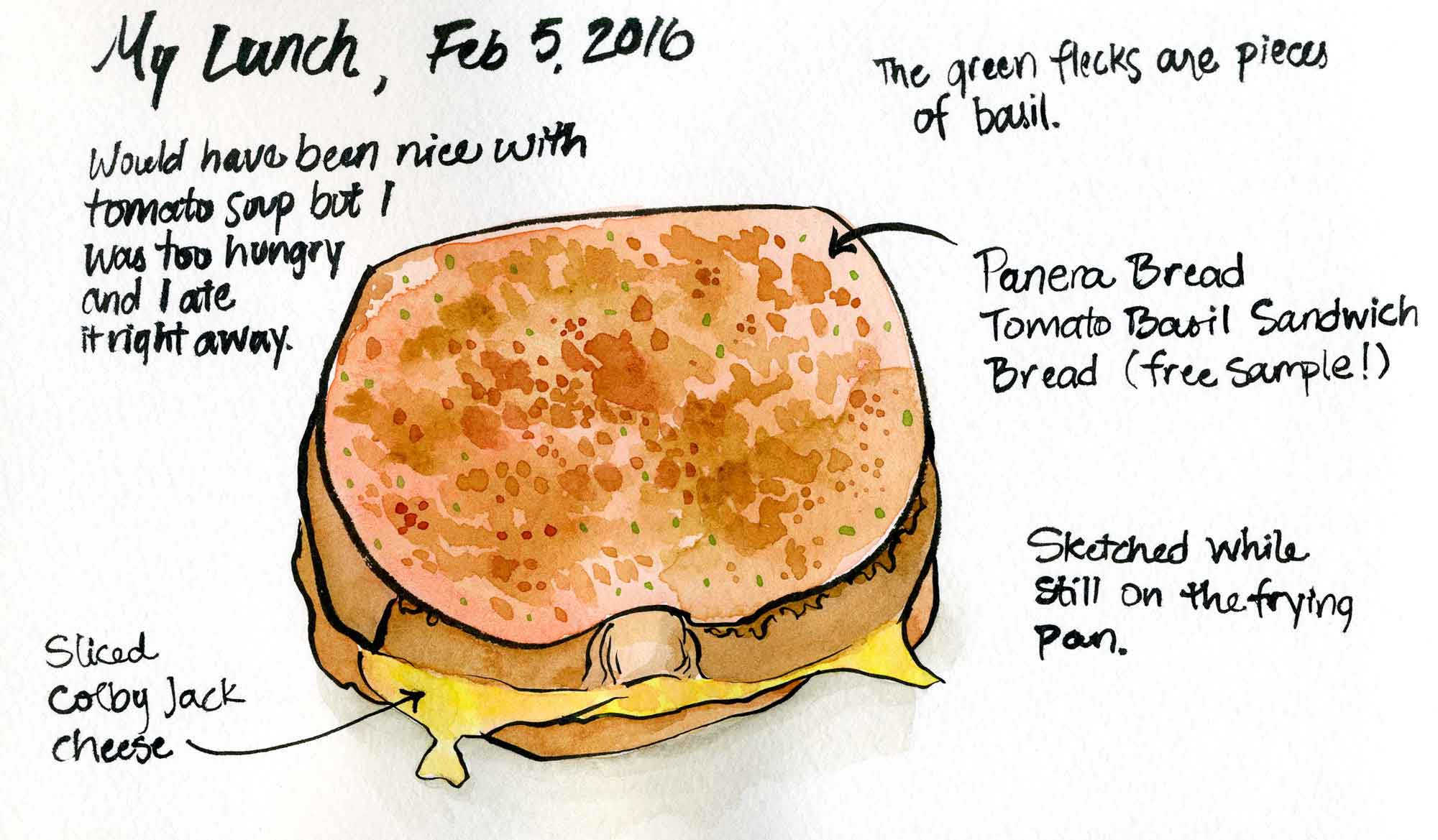
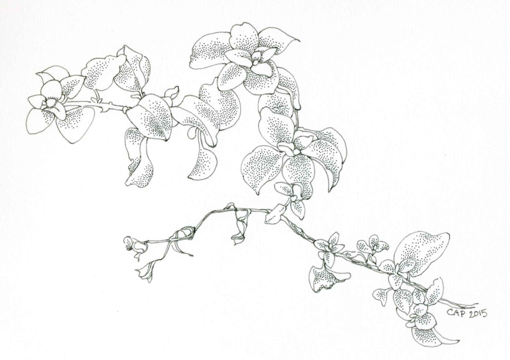
Preparing for Inktober: thoughts on some pen and ink instructional books
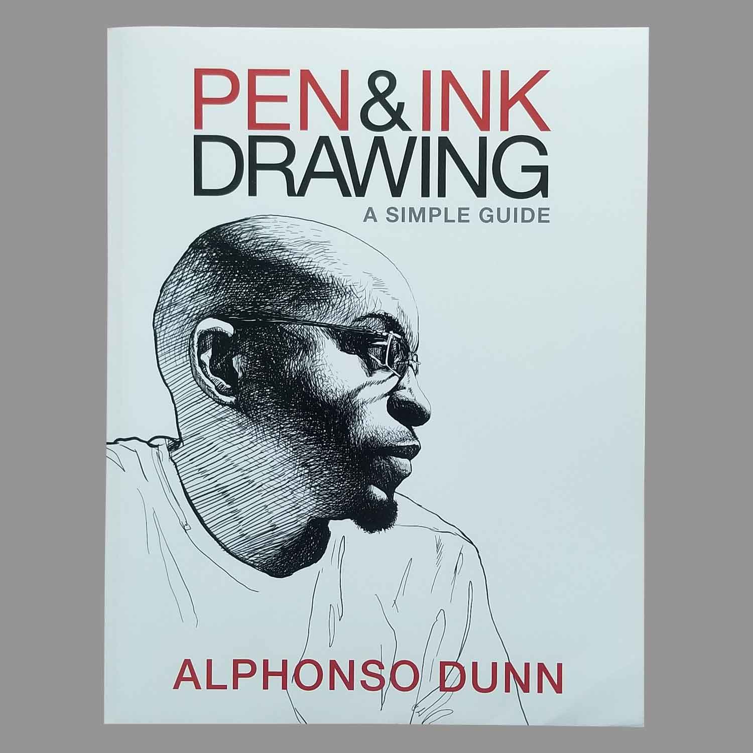
pen and ink mountain sketch

Explorers’ Sketchbooks

Although I have taken some memorable trips in the past, I am more of a homebody and prefer the comfort of my familiar environment. I do love to read travelogues and travel vicariously through other people’s photos though.

I recently found the book Explorers’ Sketchbooks: The Art of Discovery & Adventure by husband and wife Huw Lewis-Jones and Kari Hebert. It is a thick book (320 pages) and features photos of artists and sketchbook spreads from 70 different explorers’ sketchbooks, logs, and nature journals.

I haven’t had a chance to read all of the profiles yet, but I’ve been enjoying myself by reading one or two essays at a time in spare moments. I really like how there is a mix or photographs showing the book in its entirety (tattered pages, crumbling spine, etc.) as well as details of individual drawings and photos/drawings of the artists themselves. Another thing I appreciate is that the featured sketchbooks are from modern day explorers as well as those from the more distant past. Although many of the sketchbook pages shown are beautifully illustrated, there are also some utilitarian pages included with lists of figures, diagrams and penciled in comments.

I think my favorite sketchbook so far is from Edward Norton. He had some majestic mountain landscapes featured, as well as closeup studies of plants. His quote below reminds me of something that a modern day plein air sketcher would say.

“I sketched feverishly, my water freezing as fast as I put it on the paper, as also my fingers.” -Edward Norton (1884-1954)

Clearly this book was on my mind when I came across some of my late great uncle’s photographs while organizing through my reference photos on the computer recently. I couldn’t resist making an ink and watercolor interpretation of this mountain scene as if I were on location. Unfortunately, my uncle didn’t label or organize any of his photos so it is a mystery as to where he was when he took the photo.

If you can recognize this scene, or can suggest any similar books featuring the inside of sketchbooks, please leave me a comment below.

pen and ink mountain sketch
©2018 Carolyn A Pappas, Exploring (4/6/2018). Noodler’s Luxury Blue and Lexington Gray ink and watercolor wash in large moleskine.
nature sketching

Review: Pentel Arts Hybrid Technica Pen

I recently came back from a trip to Washington, DC where I got to visit a Blick store. While I was there, I got some new pens, including the Pentel Arts Hybrid Technica Pen. This is a gel pen with a metal tip and acid-free, archival, water and fade resistant ink. It comes in five sizes, from 0.3 mm to 0.8 mm. I got the 0.3 mm size to try out because I usually go for the finest lines. Below is a nature study I did in my Moleskine watercolor sketchbook using this pen.

forest lily drawing
©2018 Carolyn A Pappas, Forest Lily. Ink and watercolor in watercolor moleskine.

I really like this pen for the following reasons:

  • It is smooth, even on coldpress watercolor paper. I didn’t notice any skipping, ink globs, or smearing. Reviewers on the Blick website noted some issues with globbing with the larger sizes.
  • The ink is very black and the side of the pen is clear so you can easily see how much ink is left.
  • Unlike felt tip fineliners where the nib tends to relax and get larger over time, the Pentel Arts Hybrid Technica has a tungsten carbide roller ball for a consistent line.

Things about this pen that I wish were different are:

  • I wish the ink were waterproof and not just water resistant. When I used watercolor over my drawing, the bleeding was minimal, but somewhat unpredictable as some areas bled more than others.
  • I wish this pen came in other colors besides just black. I would especially like a brown or sepia colored ink.
  • I wish refills were available instead of the whole pen being disposable.

Overall, this is a great pen and perfect for throwing into my purse when I don’t want to have to worry about making sure my fountain pen is freshly inked up. I’m thinking of buying a few more in the 0.3 mm size as well as trying out some of the larger sizes.

nature sketching
©2018 Carolyn A Pappas, Forest Lily in Progress. Ink in watercolor moleskine.
mixed flower sketch

Small Travel Break

mixed flower sketch
©2017 Carolyn A Pappas, Medley of Flowers at the Party (8/20/2017). Ink and watercolor in large moleskine.
mixed flower sketch
©2017 Carolyn A Pappas, Evening Sketching at the End of the Party (8/20/2017). Ink and watercolor in large moleskine.

I had a chance to travel to Pennsylvania for my childhood friend Gwenn’s engagement party (watch a cute video of her engagement story here). I haven’t been to visit for 10 years, so it was really nice to see a lot of people and places that I remember. I sketched a selection of flowers from the arrangements at the party in ink and added watercolor at home.

I read Austin Kleon’s Steal Like an Artist on the drive down to Pennsylvania and the followup Show Your Work! on the drive back to Massachusetts. I highly recommend both as they were quick, yet power-packed reads. There was more information in Steal Like an Artist that was new to me. I found myself using the highlight feature on my Kindle often as I was reading. Since I have gotten back home, various concepts from these books have often come to mind.

hibiscus sketch

Trying out new paints: Prima Marketing Watercolor Confections

Recently I got an email from a reader asking me what brand of watercolor paint I use. I generally use Winsor & Newton and M. Graham, but I recently purchased a new set of watercolors and spend the last few weeks testing it out. I originally heard about this set on the Artist Journal Workshop facebook group that I am a member of (a great resource for hearing about new supplies).

The watercolors are made by a company called Prima Marketing based out of South Korea. The set comes with 12 half pans in a handsome metal enameled tin with a numbered color chart that fits nicely in the box. There are several sets available: The Classics, Tropicals, Decadent Pies, Shimmering Lights, and Pastel Dreams. I decided to go with Tropicals. Upon reading the reviews, some of the colors in the other sets are metallic so be aware of that.

The paint is advertised as being professional grade, but I beg to differ. The paints are numbered and there is no pigment information listed, which is a red flag. I was able to find this lightfastness chart, but the color names sound more like makeup than paint names (e.g., lilac rain, pool party, etc.) I, like many others, bought the set solely for the tin with the intention if filling it with my own paints later on. The paints are actually not that bad though, and I will definitely use them in my sketchbook, where I am not concerned about lightfastness. I was able to mix all sorts of muted and intense colors. I especially like #16 (avocado) which is a pale yellow green and nice to mix with blue or brown to make some nice earthy greens.

The best thing about this set is the price, which is very reasonable and worth it for the tin alone. This would make a nice gift for a budding child artist or someone just getting introduced to watercolor who was hesitant to spend a lot of money.

I used the paints for the following sketchbook pages. I also included an image of the color chart that came with the set.

hibiscus sketch
©2017 Carolyn A Pappas, Hibiscus Study (4/21/2017). Watercolor (with notes in ink) in large moleskine.

camellia japonica sketch
©2017 Carolyn A Pappas, Camellia japonica (4/27/2017). Ink and watercolor in large moleskine.

prima marketing watercolor
Prima Marketing Tropicals color chart

frog sketch

Product Review: Slate 2

I admit, I’m someone who likes gadgets and I recently got a new one, the Slate 2, which I thought I’d review for you here. This device acts like a clipboard that digitalizes your drawings when used with a drawing utensil surrounded by a metal ring. It is advertised as a way to combine digital art with “the pleasure of drawing on paper.” Basically, you draw on the paper and then your lines appear on the screen. You can change the color, opacity, nib size, and simulated drawing utensil (pencil, ballpoint, felt tip, marker, chalk, airbrush, and eraser). There are a few downsides, though:

  • The equipment is glitchy. There were unwanted lines that appeared on the screen when holding the utensil just above the surface. This may be useful for the airbrush feature, but it is a big problem if you want to do detailed hatching, for instance. I read in the help forums that this issue can be made less noticeable by placing the stroke smoothing setting on LOW and the speed sensitivity on HIGH. This did help, but it did not totally eliminate the problem.
  • There were also issues with the calibration of the utensil because there was a slight discrepancy between where my pencil was on the paper and where it showed on the screen. I found myself attempting to correct for this (you can see it a little bit on the replay). Therefore, the paper drawing I ended up with was not anything I wanted to keep afterward.
  • There is no pressure sensitivity. With the pencil setting, you can choose between different hardness levels, but this feature is very limited.
  • There is no bluetooth feature on a PC. It is annoying for me to have to use a USB cord at all times, especially when there are strict guidelines about how far away you must keep the unit from other metal objects, magnets, and computers/electronics.
  • The company is located in France and I read in some comment threads that it was next to impossible to return it.

Even still, I think this is a fun toy. The price was not that bad, but if I wanted to get something for serious digital art, I would probably get an iPad Pro. The Slate 2 is definitely not anything I would use to create a serious piece of artwork with unless the glitches were corrected. I do like the replay feature and I think I would like to experiment with this some more. There is a feature to use the device without being connected to the software and then transferring the image to the computer afterward, but I have not used this yet and I am hesitant to do so with the problems I’ve encountered thus far. You can see my sketch and replay video below. I hope this review is helpful to anyone who may be considering this device.

frog sketch
©2017 Carolyn A Pappas, Frog Sketch. Sketched on Slate 2 (pencil mode).

My thoughts on the new moleskine paper

leaf shapes sketch
©2016 Carolyn A Pappas, Variety of Leaf Shapes and Sizes (6/26/2016). Ink and watercolor in large moleskine.
onion nature study
©2016 Carolyn A Pappas, Uprooted Onions (6/25/2016). Ink in large moleskine.

These are the first two pages I did in my new moleskine (a black one, this time). I immediately noticed a difference in the paper (it was advertised to be improved for paint). A short time ago, Roz Stendahl wrote an extensive review of the new paper.

My thoughts were that the paper was definitely whiter than the previous version, which I appreciated. I also noticed less buckling with watercolor. The paper handled ink nicely. The only thing I dislike about this paper is that it is noticeably thinner and “see through,” so that I cannot comfortably draw on both sides of the page. The paper also seems to wrinkle more easily. I am planning on only using one side of the page and I probably won’t do many double page spreads.

The reason why I like moleskines are that they look neat when closed and the elastic band keeps everything well contained. The large size is the perfect size for me to carry in a purse while still having a decent enough area to work with. I also have had a number of moleskines over the years and I like how they look stacked up. In the past, I have disposed of old sketchbooks, but I have decided to keep new ones going forward as I think my daughter would like to have them when I am gone. Also, I have more space to store them now, thankfully.

imaginary landscape painting

Playing with White Gel Pen

imaginary landscape painting
©2016 Carolyn A Pappas, Secret Pond. Ink, watercolor, white and silver gel pen in large moleskine.
blue teapot design
©2016 Carolyn A Pappas, Blue Teapot with White Floral Design. Watercolor and White Gel Pen in large moleskine.

I got a white (and silver) Sakura Gelly Roll pen recently and tried it out in my sketchbook. For the fantasy landscape, I used it for the stars and on the teapot, I used it for the floral design. I haven’t used a white pen since I was a child but I remember the same frustrating feeling of inconsistent ink flow, ink that wasn’t truly opaque and visible scratches in the ink from the metal nib. Even still, it is satisfying to see the white lines on a dark background. In some of the facebook sketching groups I am a part of, the Uni-ball Signo Broad UM-153 Gel Pen is recommended because the ink flow is very smooth and opaque. I think I will definitely try the Uni-ball pen out in the future. If you have another recommendation for a white gel pen, please let me know in the comments.

grilled cheese sketch

Review of Sketchbook Skool: Expressing

This past January I signed up for the Sketchbook Skool six week “kourse” called Expressing as part of my goal for this year to focus more on my personal sketchbooks. This is my honest review of the program for the benefit of anyone else who may be considering enrolling.

The main reason why I signed up was because Michael Nobbs and Penelope Dullaghan were being featured as instructors, and I am a long time follower of both for many years. Also, I enrolled with a 20% off promo code which made the normally $99 cost a bit easier to swallow.

The kourse was broken up into six, one week long lessons featuring a different artist each week. Each weekly lesson consisted of a series of short (10 minutes or less) videos (introductory, biographical, sketchbook tours, and demos). Most of the videos had question prompts meant to spur discussion in the forums. There was also a weekly homework assignment with instructions to post in the forums for the other participants to view and/or comment. Some of the topics in the kourse included traditional watercolor techniques (such as glazes and washes), hand lettering, handmade books (mostly how to do the design and layout of the content, NOT bookbinding itself), sketching digitally on a tablet, and some very cool printmaking techniques. These are some of my impressions on Expressing:

Pros:

  • The videos were professionally produced with music, bright lighting, and nice zoom in shots so you can see clearly.
  • The website is attractively designed with black text on bright white backgrounds and lots of pops of bright colors.
  • New lessons were posted each Friday, which is ideal for someone who works M-F and wants to spend time on the weekends viewing the new content.
  • The artists featured each week were all different from each other in terms of style and approach. I really enjoyed the variety.
  • The courses and videos remain available for users to view after the end date of the six-week program. I didn’t actually finish the kourse so I will definitely be taking advantage of this.
  • Danny Gregory (co-founder of Sketchbook Skool) posted little videos of himself doing the weekly homework on his blog every week. I really liked these videos and I would recommend looking them up if you’d like more of a feel for the content before signing up.

Cons:

  • The videos were very short and mostly focused on talking, with very little time in comparison spent on demos. There was one week in particular which was so heavy on talking and biographical information that it generated some user complaints. I did notice that some extra content was posted to this lesson in the following days, however. I was disappointed because I had the impression from promo material that this particular week was to focus on making books, but I had seen all the same content elsewhere (accordion books and mini one-page books). The instructor referred participants to a how-to book on book-binding for more information.
  • Every time I logged in on Fridays to view the new lessons, there were a number of participants who had already viewed all of the videos and posted their completed homework. I am on EST and usually logged in around 9 or 10 am on Friday. I realize that people in other time zones could view the content earlier than me, but I thought that the amount of content in each lesson could have been more as it was intended to cover an entire week.
  • There were some technical issues which prevented some people from being able to download PDFs from the site. Eventually, this issue was fixed but there were a lot of comments about it in the forums which distracted me from the content. Hopefully, this issue is fixed for future iterations of the kourse.
  • Even though most of the homework can be done with materials that you probably already have on hand (pencil, ink, watercolor, etc.), I would have appreciated a materials list before the kourse started. If this was posted, I missed it. I absolutely LOVED Penelope Dullaghan’s week, but there were some materials that she used that I don’t have as a part of my normal supplies such as oil paint, rubber brayer, acetate sheets, linoleum and lino carving tools. I was so inspired after watching her videos, but I didn’t have the stuff on hand so I wasn’t able to jump in and do the assignment like I would have done otherwise.

My completed homework for Felix Scheinberger’s week:

grilled cheese sketch
©2016 Carolyn A Pappas, My Lunch (2-5-2016). Pentel Pocket Brush Pen and watercolor in large moleskine watercolor sketchbook.

My overall impression of this Sketchbook Skool kourse is that it is ideal for someone who is relatively new to drawing and keeping sketchbooks and who needs/wants a lot of encouragement, inspiration, and interaction with others to stay on track. The inspiration and information I gained from the kourse was very worthwhile for me, but I don’t think it would be worth $99.

I also think this format may not be for me, or that I have some ADD tendencies, because I started to get distracted and lose track and never officially completed all the lessons or all of the homework. The forums seemed a little awkward for me to use so I largely didn’t participate in the discussions. I find the setup of facebook groups more conducive for giving and sharing feedback in general.

Ultimately, it is not necessary AT ALL to take a class on how to keep a sketchbook. When I think back over the years, I realize I have learned the most by just looking at other people’s artwork, and from books. If you like to get video based information, then Sketchbook Skool might be for you. For free, you can look for videos on YouTube and you can also check out Strathmore Free Online Workshops (keeping in mind that they are meant to promote Strathmore products). For less money than Sketchbook Skool, you can also find some art courses on Craftsy (look out for sales) and Creativebug (they offer a free 14 day trial). If you know of any other sources for video based art instruction, please leave me a comment because I’d love to check it out!

I'll Run Till the Sun Goes Down

I’ll Run Till the Sun Goes Down

I'll Run Till the Sun Goes DownThis past weekend I’ve been reading this book nonstop (instead of studying microbiology). I have been online friends with David Sandum for a few years now, but I really feel like I know him so much better after reading his new memoir about overcoming depression and anxiety through art. I pre-ordered it months ago and it showed up in my mailbox last week and I was so excited.

Every chapter starts off with an excerpt from David’s journal from that particular time in his life. I love that the chapters are short and sweet, making the book easy to pick up and put down. Also, David tells his story in such an easy, conversational way that it really feels like you are sitting down and having a little chat.

I could really relate to David’s struggle with finding traditional corporate jobs unmanageable, and struggling with the pressure of supporting a family when he couldn’t seem to “get his act together.” After years of battling crippling depression and anxiety, David finally found his place in the world when he discovered art and it gave him an outlet and a sense of purpose. Unlike so many biographies of artists which can have sad endings, I really found it inspiring to know that today David is a successful, full time artist with a loving family.

The biggest takeaways I had after reading this book are the value of maintaining strong friendships and the importance of sheer determination when facing obstacles. I really found it inspiring to see someone with so many struggles make something of his life. Also, I found it interesting to read about Scandinavia in a realistic way (i.e., not being portrayed as some kind of utopia).