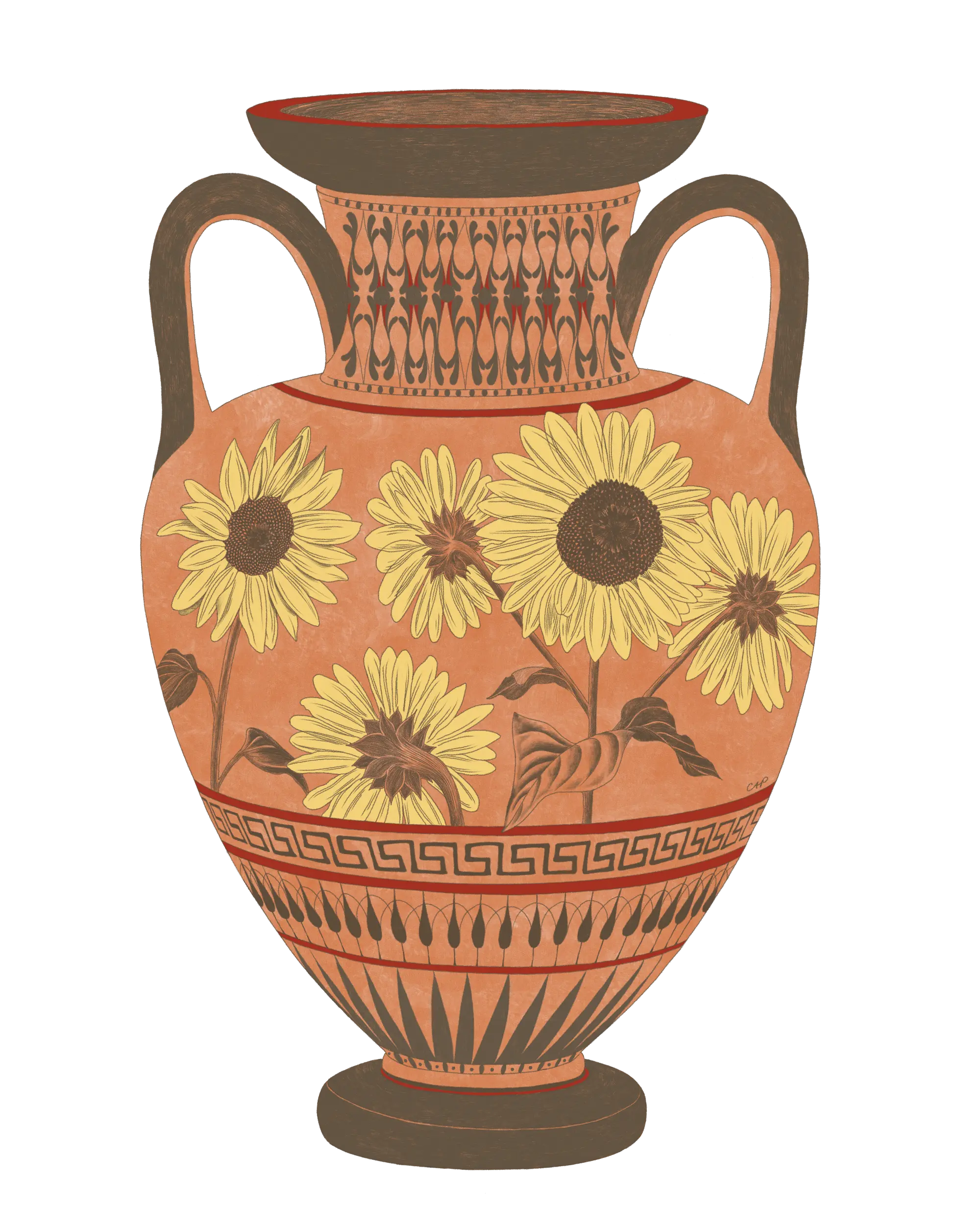
Some updates and a new drawing
Thank you all who have been praying for my eye. It has been a really challenging time for me but I have been committed to reducing my stress to help my eye heal. I went back to the eye doctor…
Thank you all who have been praying for my eye. It has been a really challenging time for me but I have been committed to reducing my stress to help my eye heal. I went back to the eye doctor…

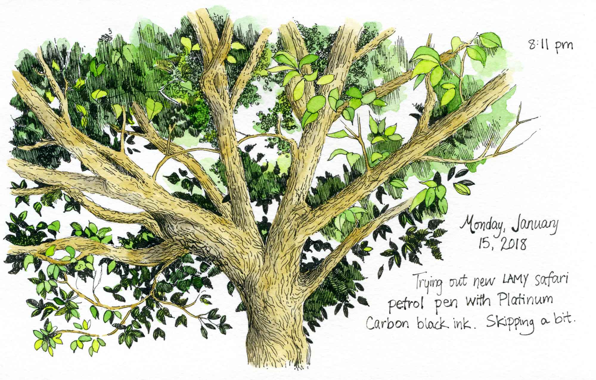
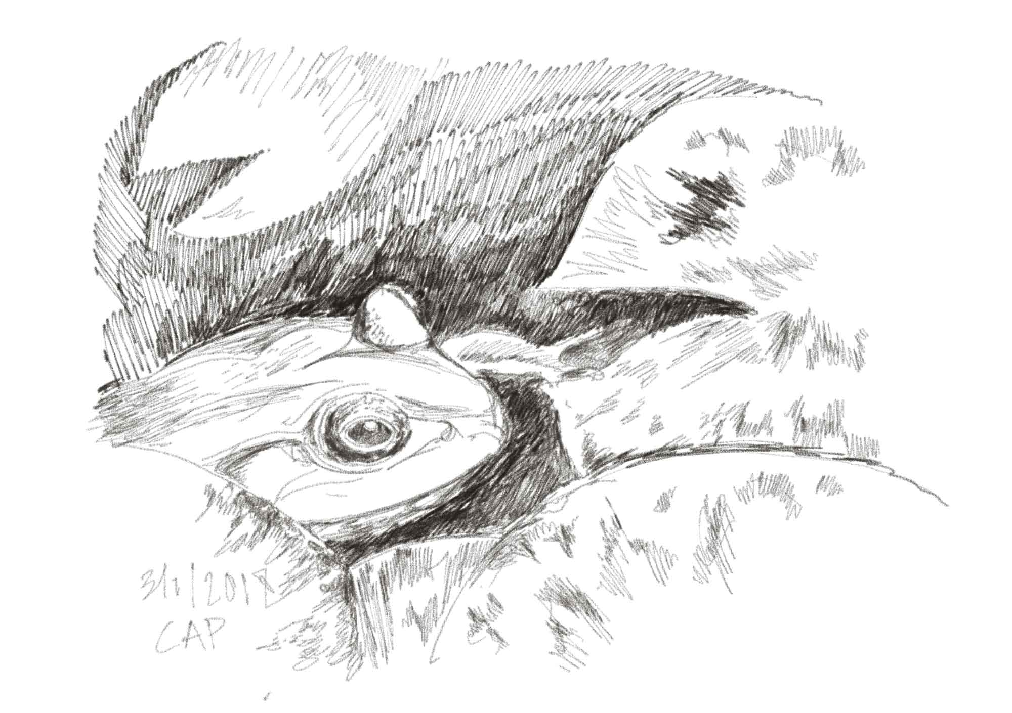
Since April, I’ve been using the Platinum Carbon Desk Pen with Platinum Carbon black ink. I originally heard about this pen through an art facebook group that I’m a part of. I used the ink cartridge that came with the…
I haven’t been this excited in awhile. A few months ago I got an illustration job that was perfect for me. I was commissioned to make some artwork with a new line of watercolor brush pens by the Inspire! Art…
I took a break from art for a few days to get my studio (i.e., my bedroom) in order. I wasn’t really happy with the lighting in my space, so I made a change and swapped bedrooms with my daughter.…
I recently came back from a trip to Washington, DC where I got to visit a Blick store. While I was there, I got some new pens, including the Pentel Arts Hybrid Technica Pen. This is a gel pen with…
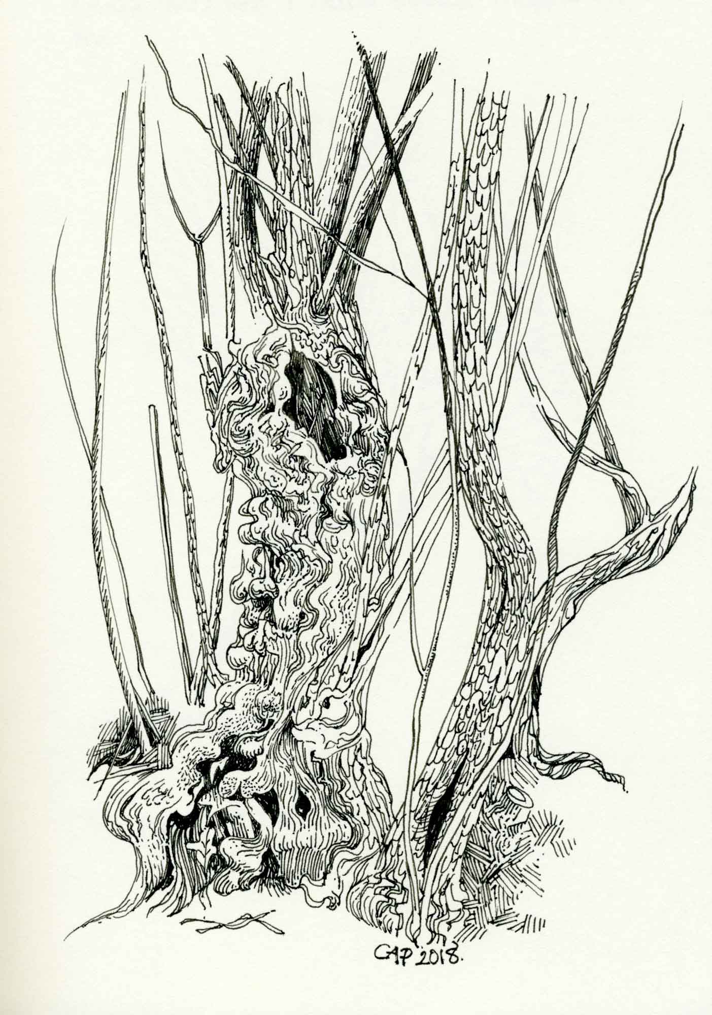
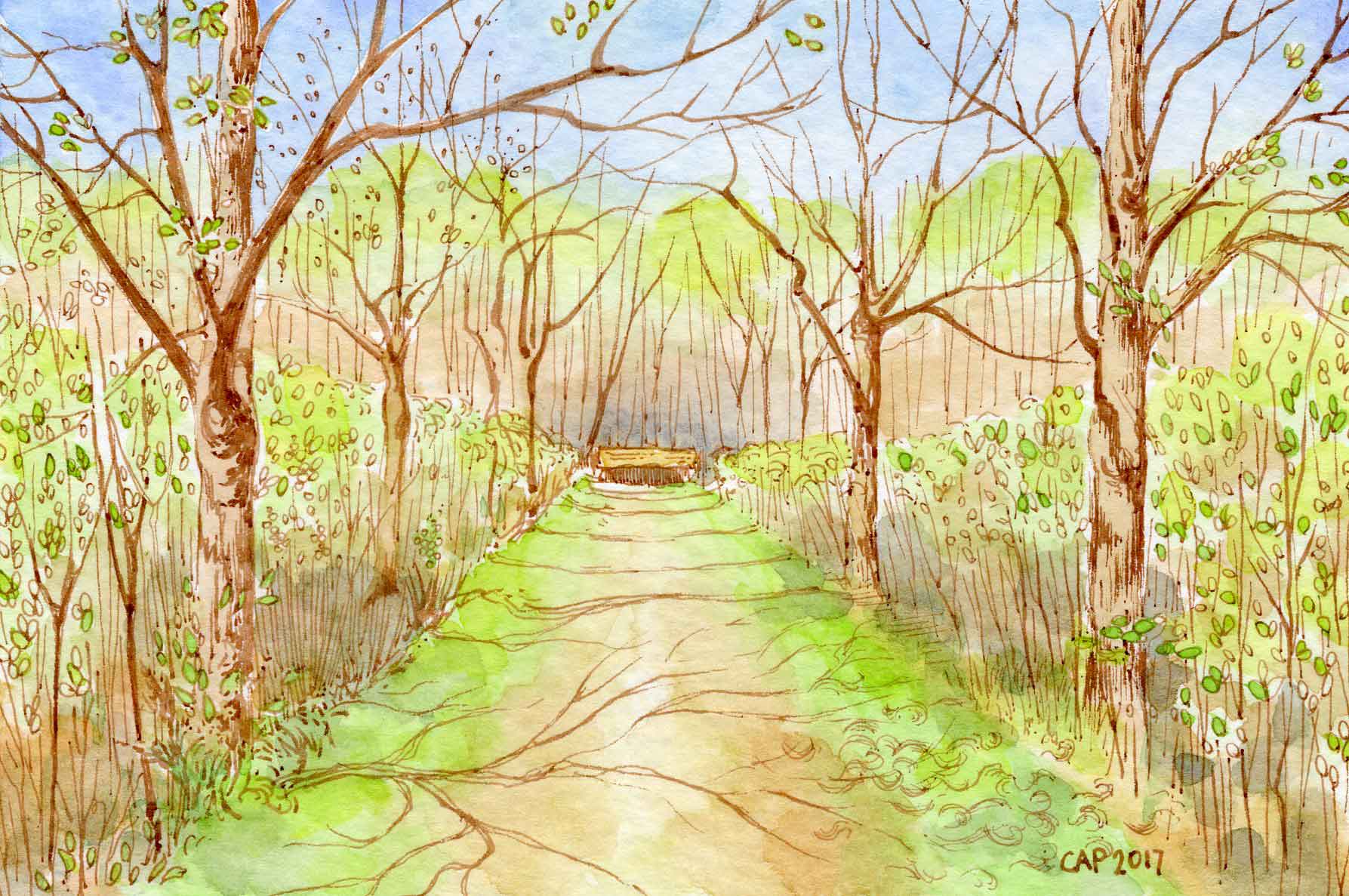
I’ve been doing a lot of drawing, painting, thinking, and planning lately (as well as studying). My mind has been drifting to trees lately: the trunks, branches, and leaves that appear in my sketchbooks, but also the deep roots below.…
These are some of the blank greeting cards that I painted over the past year. I had a recipient for each of these in mind when I painted the cards, but it is a goal of mine in the upcoming…
At the end of July, I took a day off from my studies to go out sketching at Tower Hill’s Free Fun Friday event (free admission for the public). As a member, I had never attended this event in the…
A few weeks ago I came across this blog post about how to implement a minimalist strategy with art and crafts supplies. Some of the author’s opinions are a little extreme and I prefer high quality materials even for sketchbook…
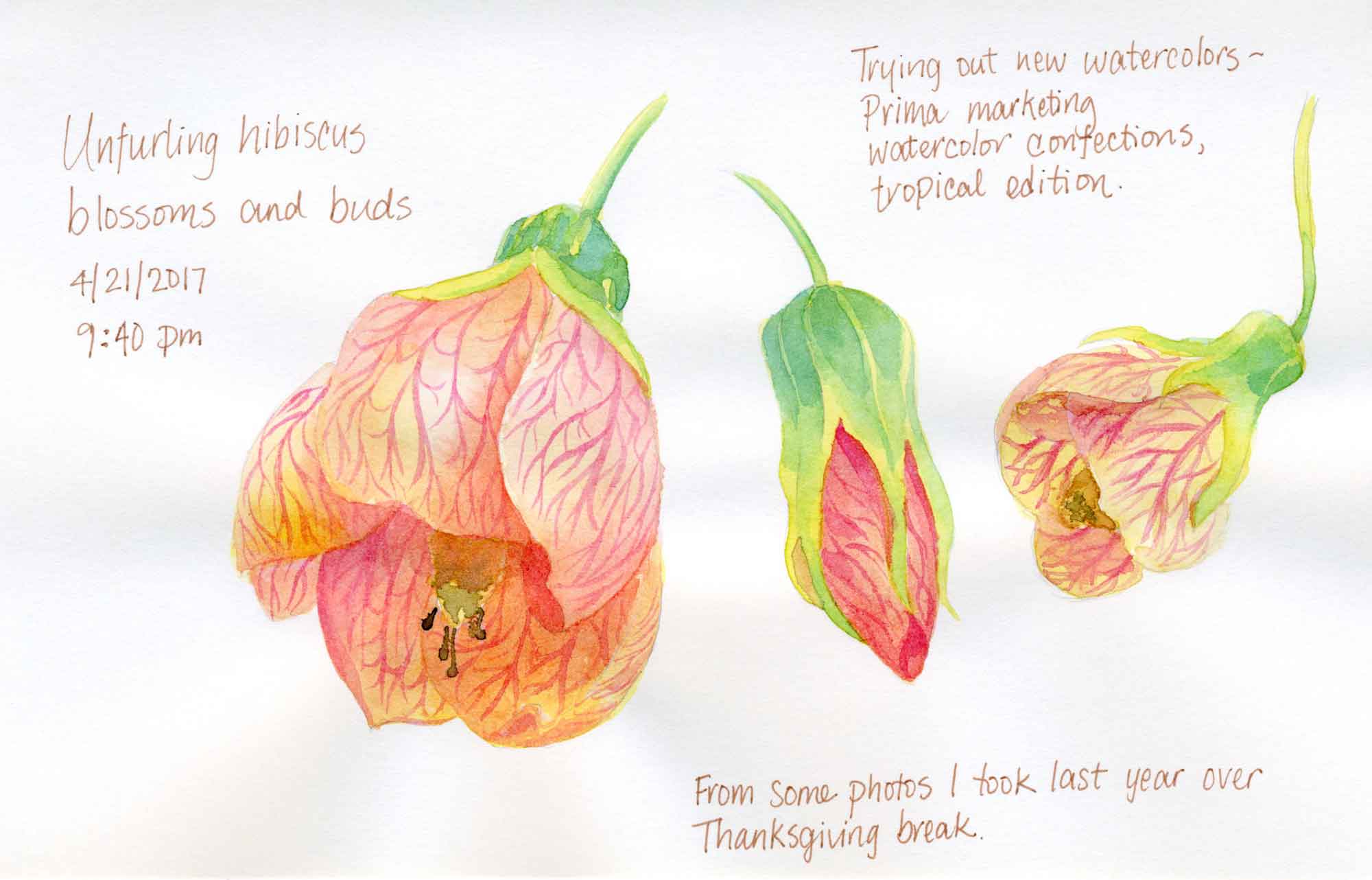
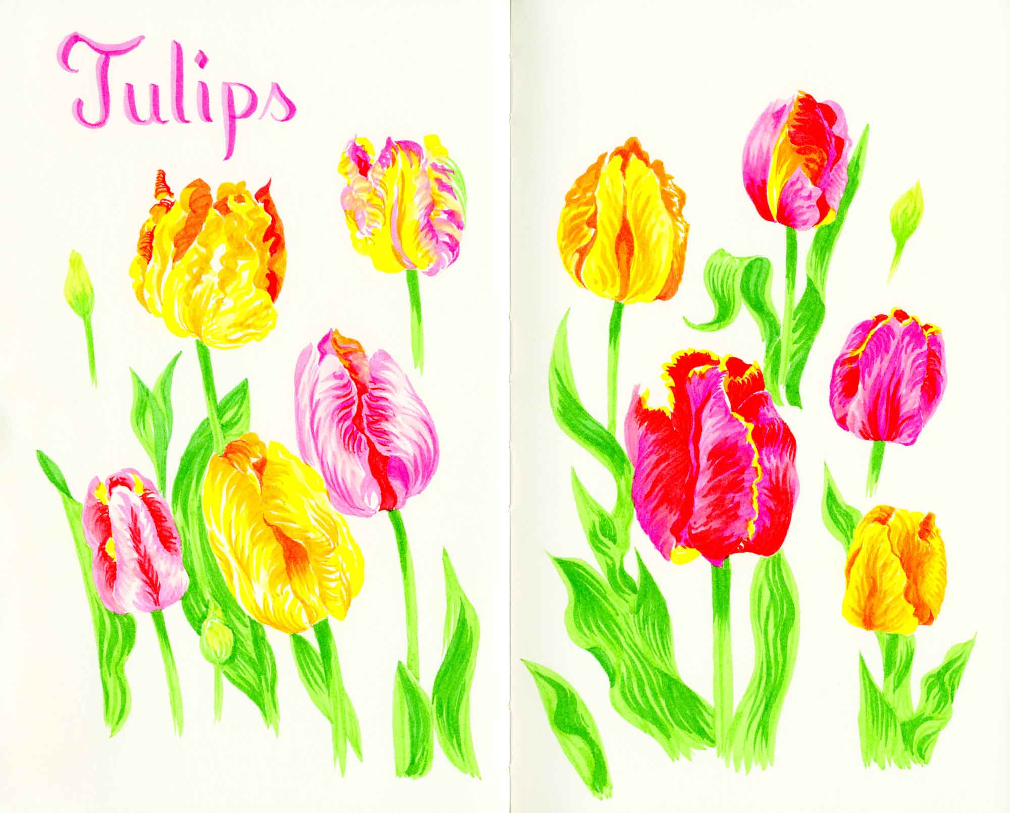
Recently I got an email from a reader asking me what brand of watercolor paint I use. I generally use Winsor & Newton and M. Graham, but I recently purchased a new set of watercolors and spend the last few…
The first day of spring is one thing, and the first spring day is another. The difference between them is sometimes as great as a month. ~Henry Van Dyke It’s actually feeling pretty spring-like today, but there is still snow…
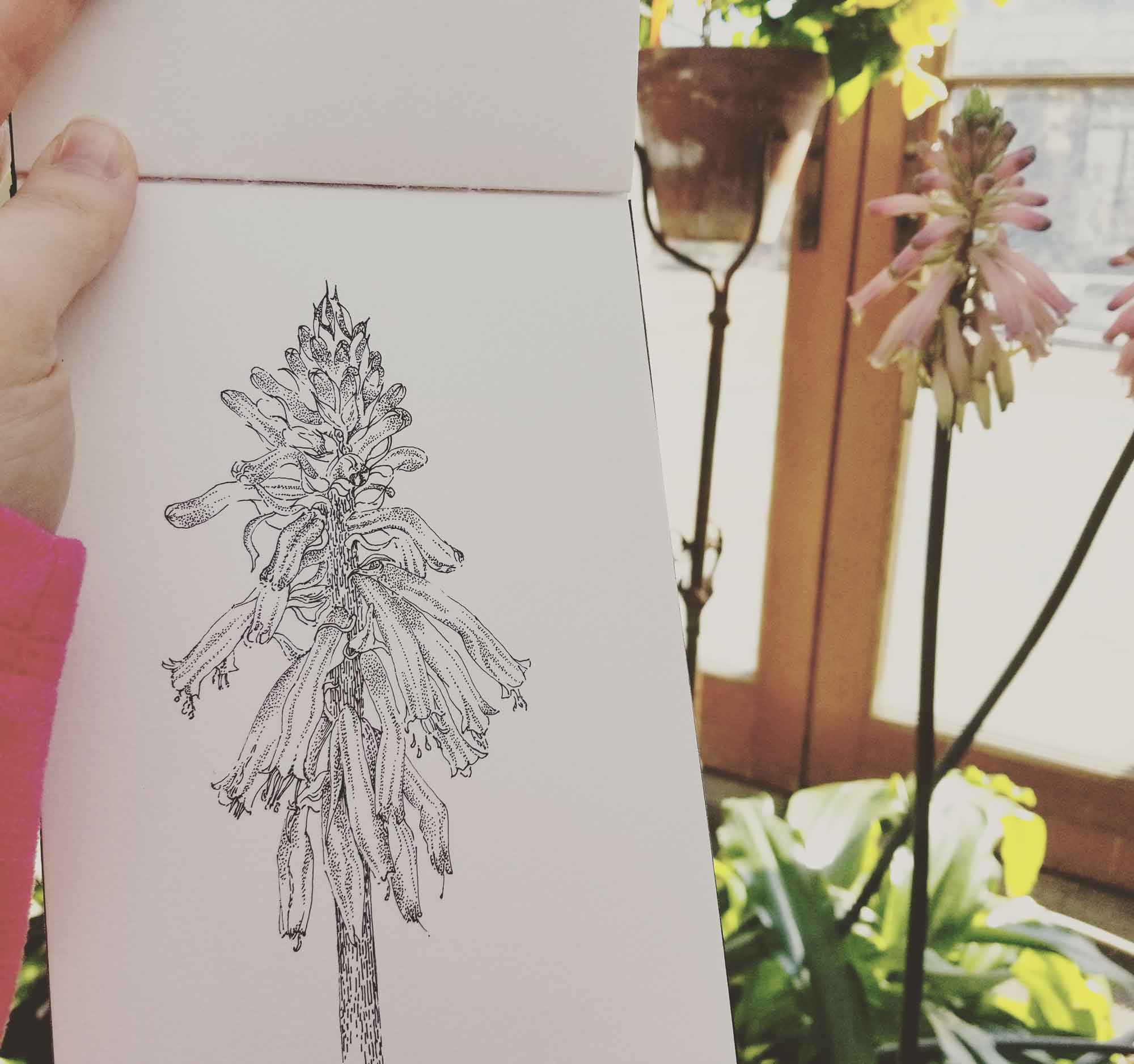
I admit, I’m someone who likes gadgets and I recently got a new one, the Slate 2, which I thought I’d review for you here. This device acts like a clipboard that digitalizes your drawings when used with a drawing…