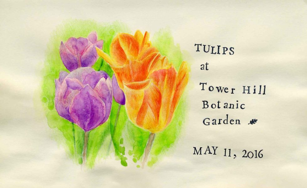
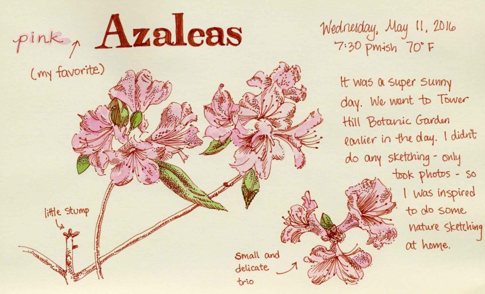
My mom, Cate and I visited Tower Hill Botanic Garden for the first time last week. What a treasure of a place! I can’t believe that I’ve never visited in over twenty years of living in Central Mass. There is a lot to look at and it changes seasonally with new things on display all year, even in winter I’m told. The tulip beds, planted in coordinated color combinations, were the highlight of the trip for me. There was also a display of fairy houses and an exhibit of watercolor paintings by wildlife artist Barry Van Dusen (on display until June 26, 2016).
I only took photos and didn’t get the time to sit and sketch this time. However, I joined as a member and will be visiting again soon with my sketchbook and a big block of (undisturbed) time.
Although I have generally been avoiding TV, I have been enjoying watching the four part Moving Art nature documentary series on Netflix. I love that there is no narration, only peaceful background music. Flowers is my favorite (not surprisingly).
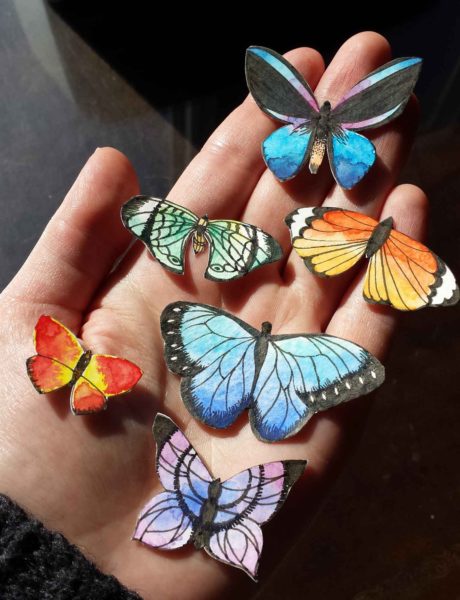
Butterflies on scrap watercolor paper. Pen and ink and watercolor.
A Recent Experiment:
I painted little butterflies on scraps of watercolor paper that were too small to use for anything else. Then I cut them out with an exacto knife. I am planning on using these little cutouts for some sort of collage project that I haven’t yet figured out. When I was drawing these, I looked up some images of butterflies online but I took a lot of liberties with the colors and patterns so they are not at all accurate.
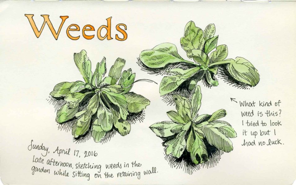
I sat on the edge of a retaining wall and sketched some weeds in the dirt this particular afternoon. As I was drawing, I moved around in order to find different clumps of weeds that interested me, which explains the uneven lighting. I tried looking up this particular weed on the UMass Weed Herbarium, but I never managed to identify it. Please leave me a comment if you know what this plant is called. There are tons of them in my yard and garden, so I’m sure it is very common.
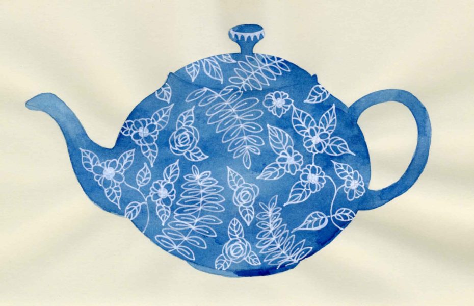
I got a white (and silver) Sakura Gelly Roll pen recently and tried it out in my sketchbook. For the fantasy landscape, I used it for the stars and on the teapot, I used it for the floral design. I haven’t used a white pen since I was a child but I remember the same frustrating feeling of inconsistent ink flow, ink that wasn’t truly opaque and visible scratches in the ink from the metal nib. Even still, it is satisfying to see the white lines on a dark background. In some of the facebook sketching groups I am a part of, the Uni-ball Signo Broad UM-153 Gel Pen is recommended because the ink flow is very smooth and opaque. I think I will definitely try the Uni-ball pen out in the future. If you have another recommendation for a white gel pen, please let me know in the comments.
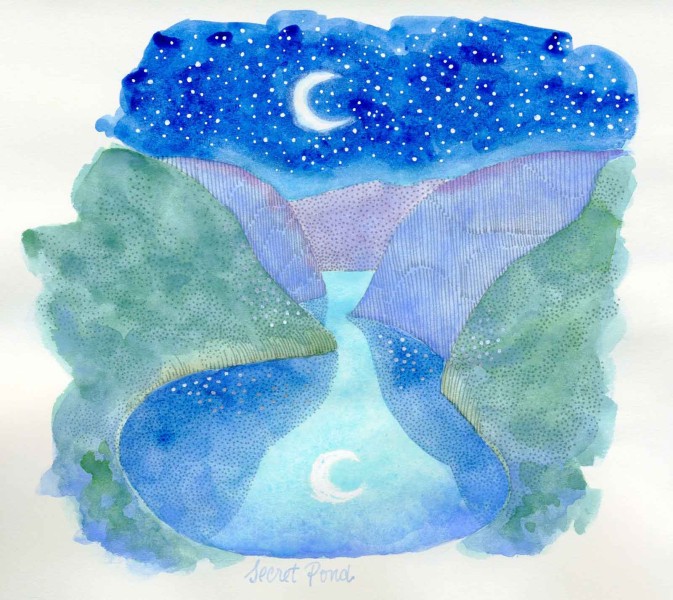
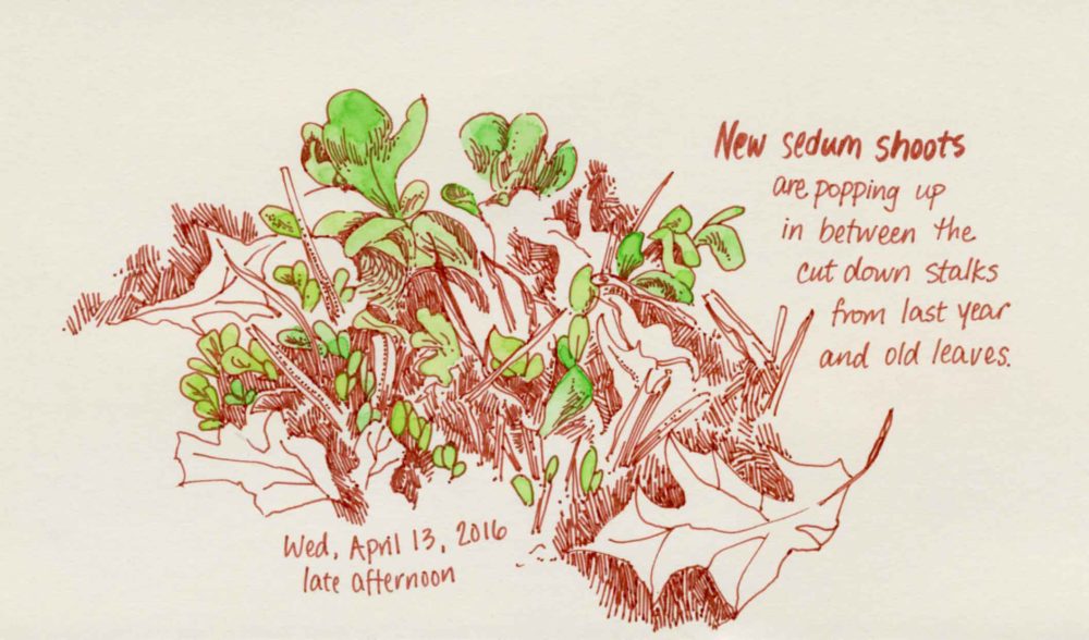
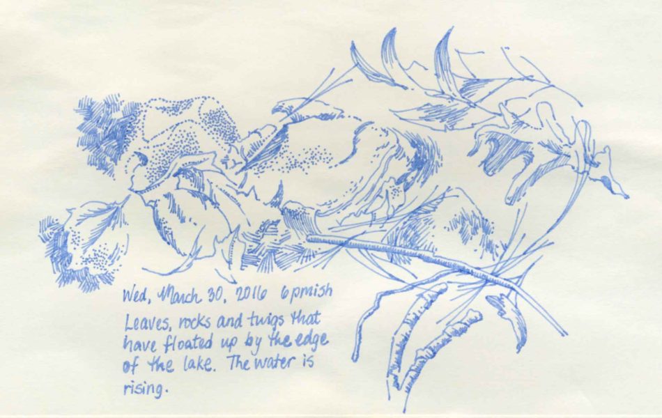
I’ve been making an effort lately to spend more time outside in the sunlight, and on a few occasions I’ve brought my sketchbook out with me. I don’t really care about the result, but I find it very relaxing to sit in the sun and make some little drawings of whatever I see on the ground. I also like to record what I see happening out there as the weather gets warmer.
This past January I signed up for the Sketchbook Skool six week “kourse” called Expressing as part of my goal for this year to focus more on my personal sketchbooks. This is my honest review of the program for the benefit of anyone else who may be considering enrolling.
The main reason why I signed up was because Michael Nobbs and Penelope Dullaghan were being featured as instructors, and I am a long time follower of both for many years. Also, I enrolled with a 20% off promo code which made the normally $99 cost a bit easier to swallow.
The kourse was broken up into six, one week long lessons featuring a different artist each week. Each weekly lesson consisted of a series of short (10 minutes or less) videos (introductory, biographical, sketchbook tours, and demos). Most of the videos had question prompts meant to spur discussion in the forums. There was also a weekly homework assignment with instructions to post in the forums for the other participants to view and/or comment. Some of the topics in the kourse included traditional watercolor techniques (such as glazes and washes), hand lettering, handmade books (mostly how to do the design and layout of the content, NOT bookbinding itself), sketching digitally on a tablet, and some very cool printmaking techniques. These are some of my impressions on Expressing:
Pros:
The videos were professionally produced with music, bright lighting, and nice zoom in shots so you can see clearly.
The website is attractively designed with black text on bright white backgrounds and lots of pops of bright colors.
New lessons were posted each Friday, which is ideal for someone who works M-F and wants to spend time on the weekends viewing the new content.
The artists featured each week were all different from each other in terms of style and approach. I really enjoyed the variety.
The courses and videos remain available for users to view after the end date of the six-week program. I didn’t actually finish the kourse so I will definitely be taking advantage of this.
Danny Gregory (co-founder of Sketchbook Skool) posted little videos of himself doing the weekly homework on his blog every week. I really liked these videos and I would recommend looking them up if you’d like more of a feel for the content before signing up.
Cons:
The videos were very short and mostly focused on talking, with very little time in comparison spent on demos. There was one week in particular which was so heavy on talking and biographical information that it generated some user complaints. I did notice that some extra content was posted to this lesson in the following days, however. I was disappointed because I had the impression from promo material that this particular week was to focus on making books, but I had seen all the same content elsewhere (accordion books and mini one-page books). The instructor referred participants to a how-to book on book-binding for more information.
Every time I logged in on Fridays to view the new lessons, there were a number of participants who had already viewed all of the videos and posted their completed homework. I am on EST and usually logged in around 9 or 10 am on Friday. I realize that people in other time zones could view the content earlier than me, but I thought that the amount of content in each lesson could have been more as it was intended to cover an entire week.
There were some technical issues which prevented some people from being able to download PDFs from the site. Eventually, this issue was fixed but there were a lot of comments about it in the forums which distracted me from the content. Hopefully, this issue is fixed for future iterations of the kourse.
Even though most of the homework can be done with materials that you probably already have on hand (pencil, ink, watercolor, etc.), I would have appreciated a materials list before the kourse started. If this was posted, I missed it. I absolutely LOVED Penelope Dullaghan’s week, but there were some materials that she used that I don’t have as a part of my normal supplies such as oil paint, rubber brayer, acetate sheets, linoleum and lino carving tools. I was so inspired after watching her videos, but I didn’t have the stuff on hand so I wasn’t able to jump in and do the assignment like I would have done otherwise.
My overall impression of this Sketchbook Skool kourse is that it is ideal for someone who is relatively new to drawing and keeping sketchbooks and who needs/wants a lot of encouragement, inspiration, and interaction with others to stay on track. The inspiration and information I gained from the kourse was very worthwhile for me, but I don’t think it would be worth $99.
I also think this format may not be for me, or that I have some ADD tendencies, because I started to get distracted and lose track and never officially completed all the lessons or all of the homework. The forums seemed a little awkward for me to use so I largely didn’t participate in the discussions. I find the setup of facebook groups more conducive for giving and sharing feedback in general.
Ultimately, it is not necessary AT ALL to take a class on how to keep a sketchbook. When I think back over the years, I realize I have learned the most by just looking at other people’s artwork, and from books. If you like to get video based information, then Sketchbook Skool might be for you. For free, you can look for videos on YouTube and you can also check out Strathmore Free Online Workshops (keeping in mind that they are meant to promote Strathmore products). For less money than Sketchbook Skool, you can also find some art courses on Craftsy (look out for sales) and Creativebug (they offer a free 14 day trial). If you know of any other sources for video based art instruction, please leave me a comment because I’d love to check it out!
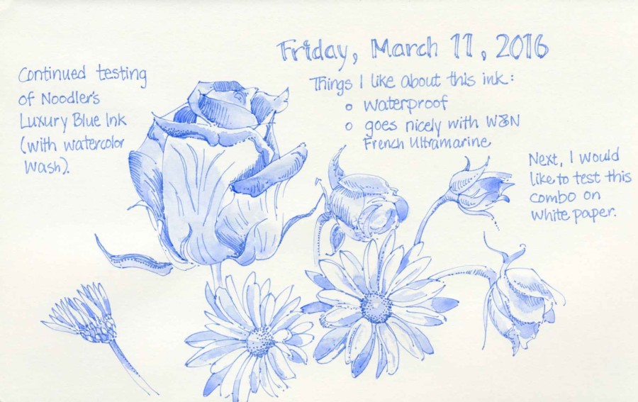
I switched out the ink in my Lamy Safari fountain pen from Noodler’s Lexington Grey to Noodler’s Luxury Blue. I’ve had this ink for some time, but it has been a few years since I’ve used it. Luxury Blue is more expensive than the other Noodler’s inks and it comes in a one ounce bottle instead of a three ounce bottle. The ink is waterproof, which is useful for both drawing with watercolor wash and also for normal writing. It works nicely with washes of Winsor & Newton French Ultramarine. I also want to try it out with turquoise and violet.