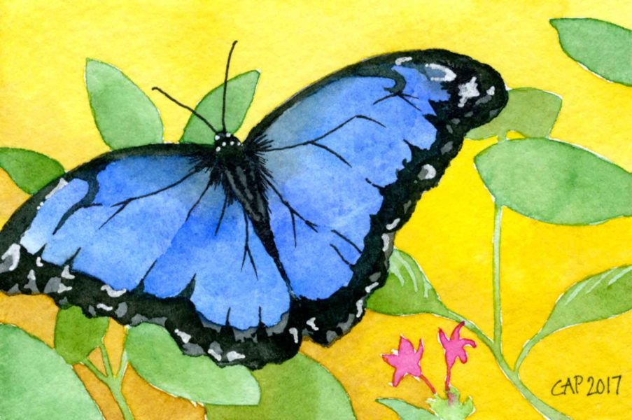
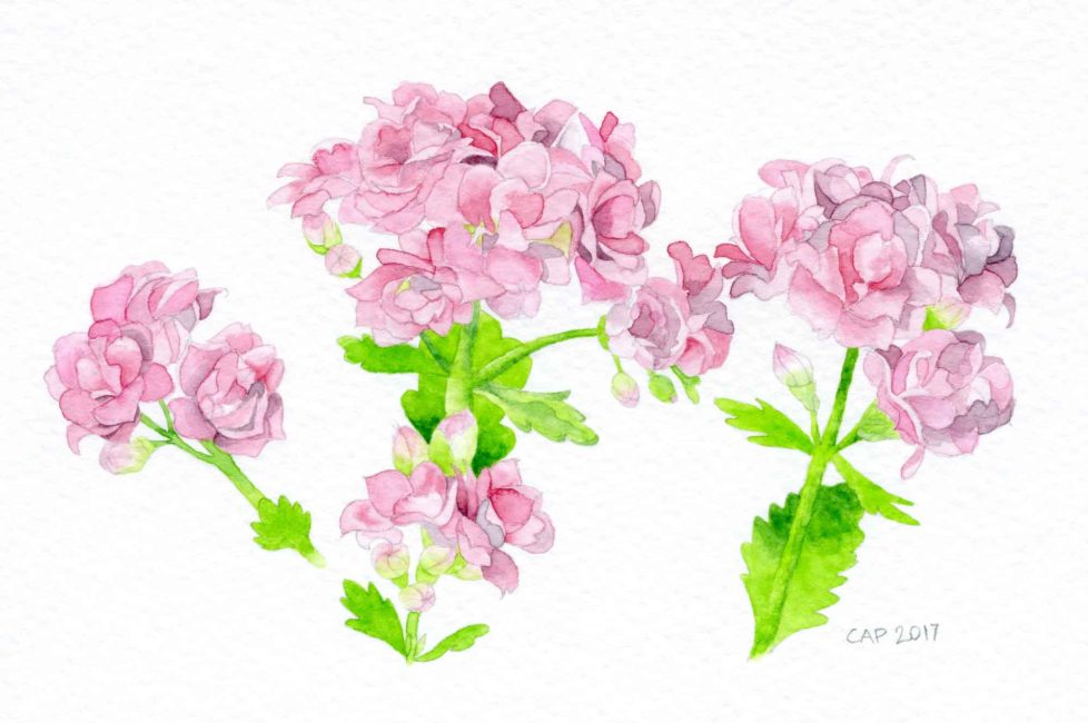
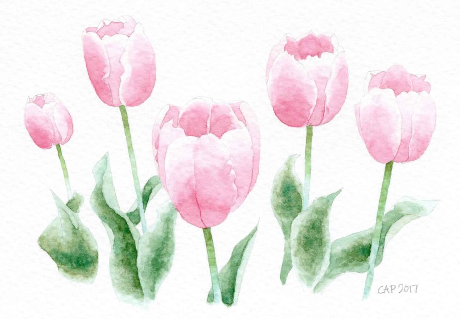
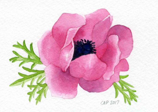
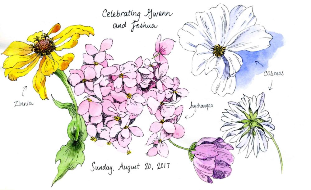
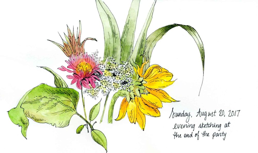
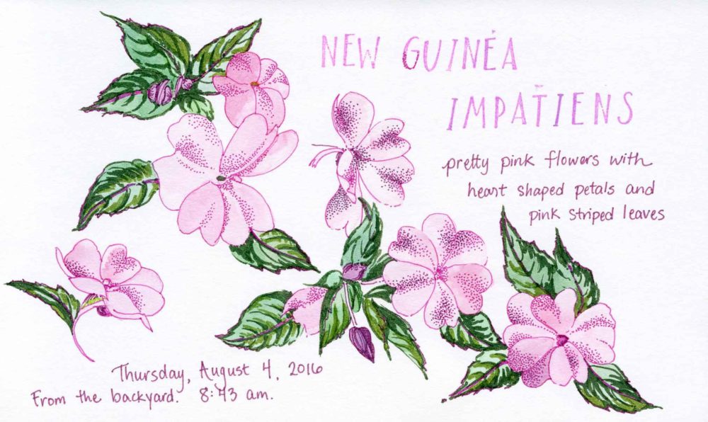
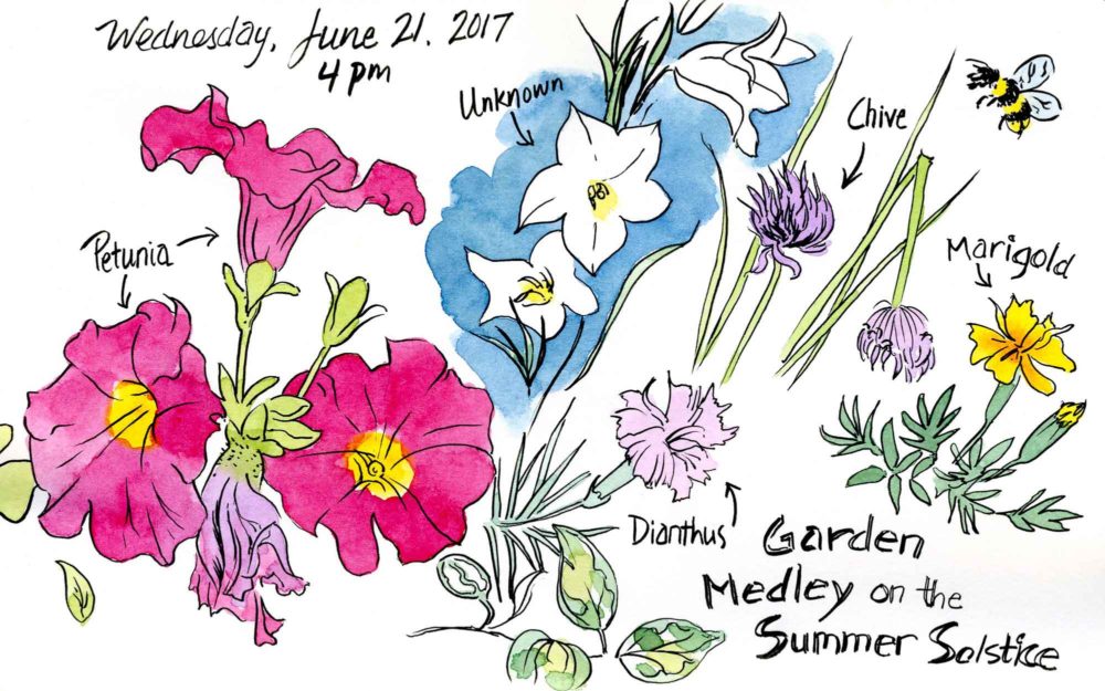
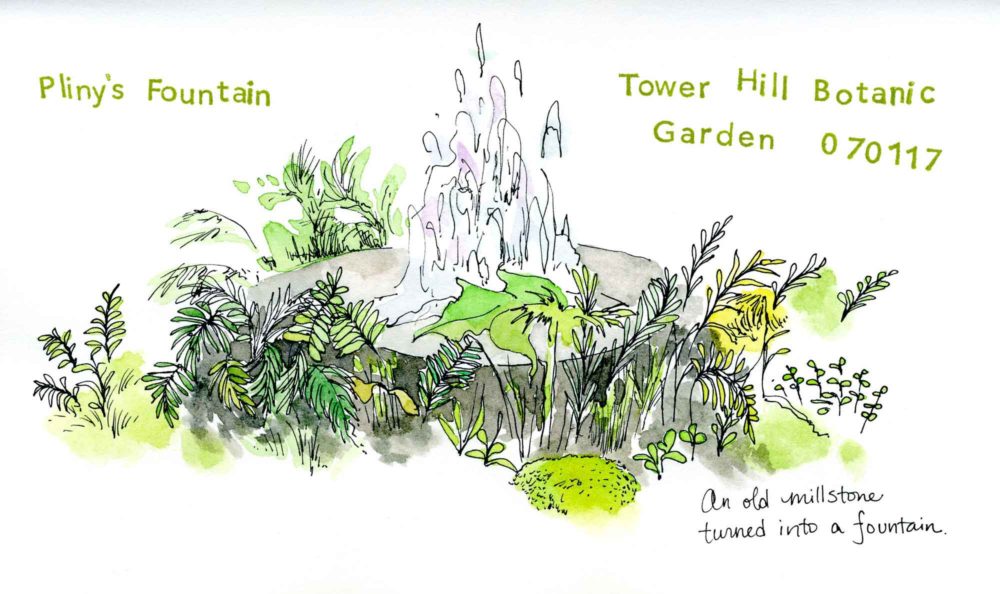
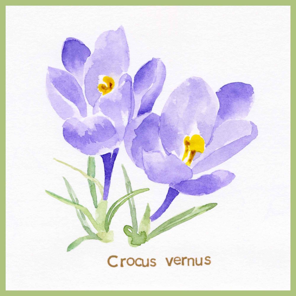
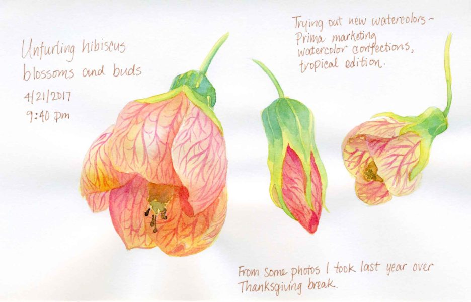
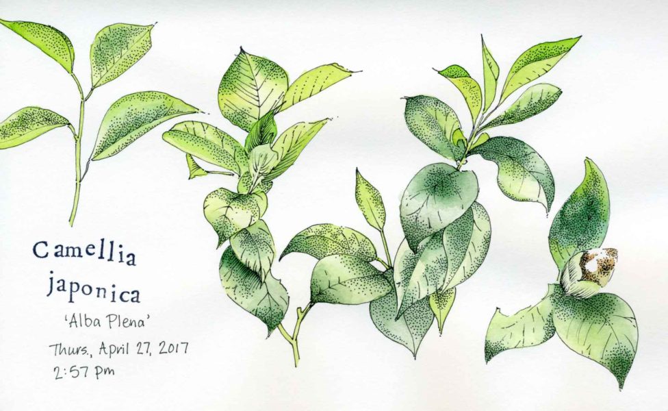
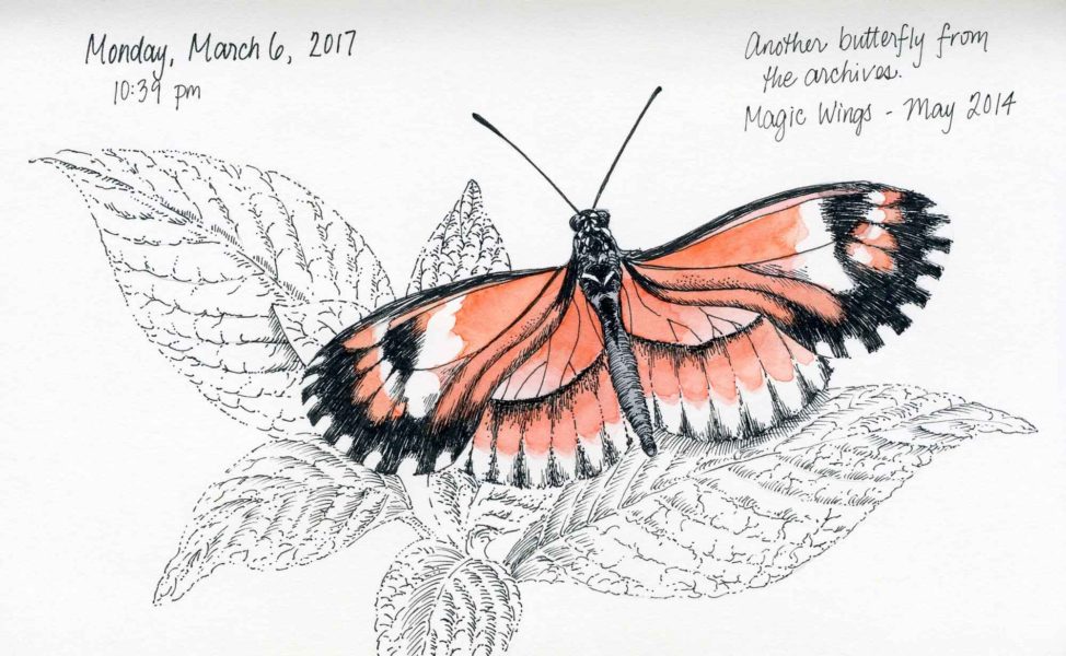
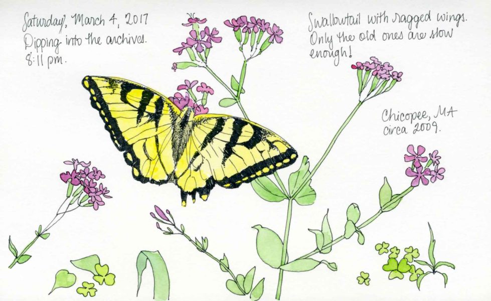
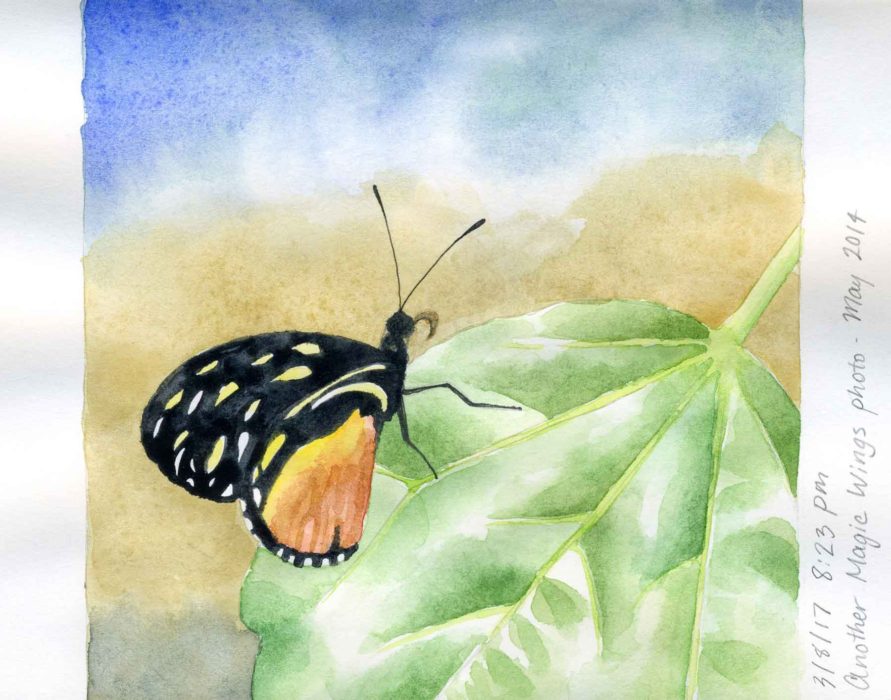
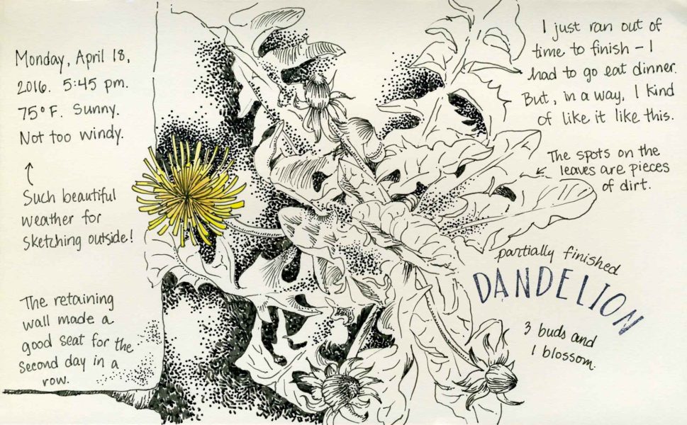
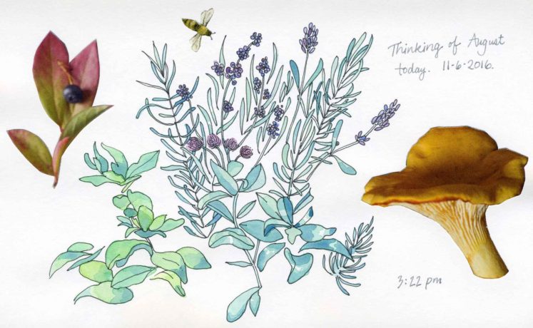
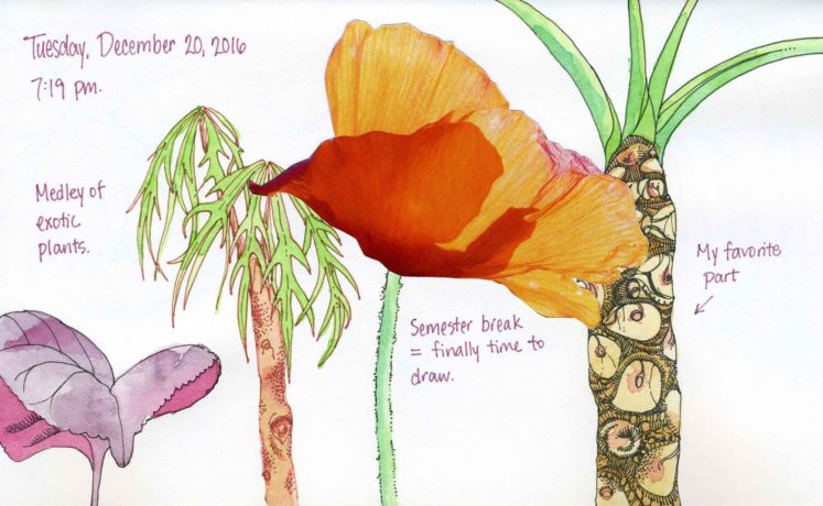
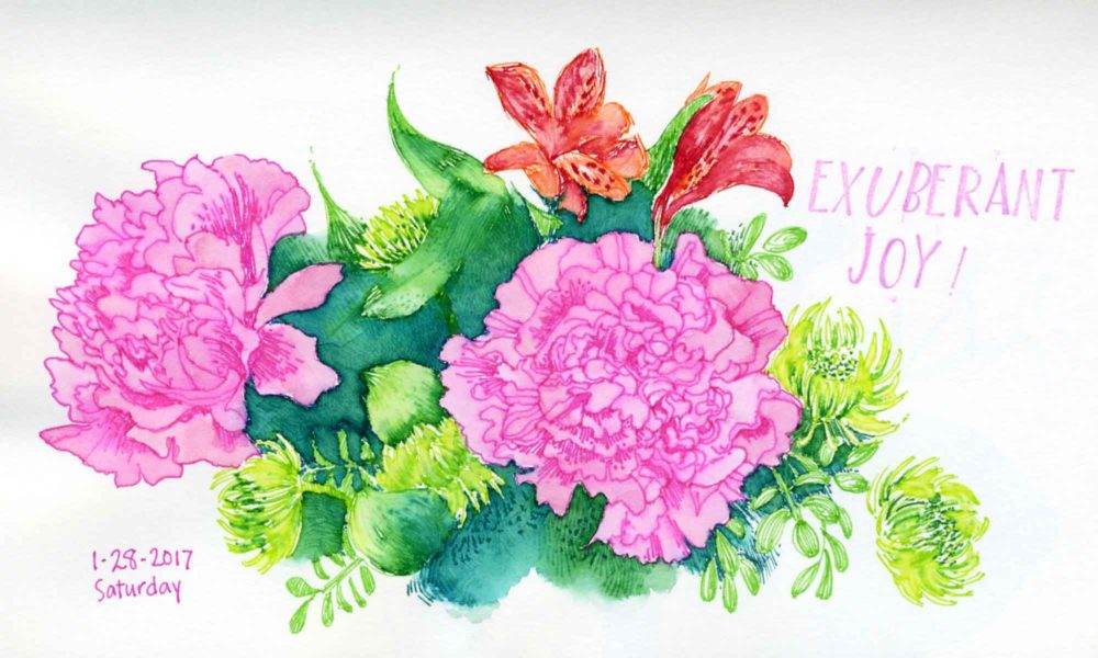
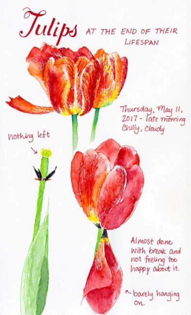
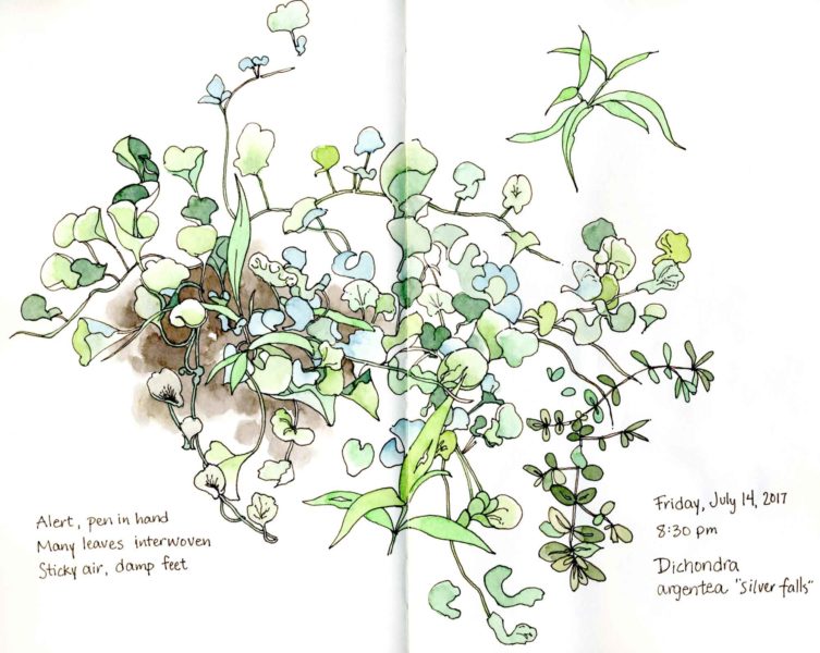
I had a chance to travel to Pennsylvania for my childhood friend Gwenn’s engagement party (watch a cute video of her engagement story here). I haven’t been to visit for 10 years, so it was really nice to see a lot of people and places that I remember. I sketched a selection of flowers from the arrangements at the party in ink and added watercolor at home.
I read Austin Kleon’s Steal Like an Artist on the drive down to Pennsylvania and the followup Show Your Work! on the drive back to Massachusetts. I highly recommend both as they were quick, yet power-packed reads. There was more information in Steal Like an Artist that was new to me. I found myself using the highlight feature on my Kindle often as I was reading. Since I have gotten back home, various concepts from these books have often come to mind.
This was a disjointed sketchbook page, as life got in the way as it often does. I remember going out into the back garden to sketch after a rough day at work due to short staffing. Midway through my drawing, the day caught up with me and I became so fatigued that I had to go inside to sleep. Two days later, I remembered my unfinished page and went out into the garden early in the morning to finish it off.
Dismiss thoughts of ‘good, bad, right, wrong, success, failure’ – be spontaneous. -Josh Goldberg
Even in my sketchbook, I tend to be very precise and make slow-going, detailed drawings. These two pages were exactly the opposite for a change. I drew the flowers while sitting on my front stoop and the fountain while sitting on a bench in the woods (getting bitten by mosquitoes).
A few weeks ago I came across this blog post about how to implement a minimalist strategy with art and crafts supplies. Some of the author’s opinions are a little extreme and I prefer high quality materials even for sketchbook work. That said, so many people out there have a problem with collecting art supplies and she definitely has some good points. I also have realized how much I have veered off track from my minimalist roots. Going through nursing school is tough (I’m halfway done with the program!) and I have definitely used art supply purchases as a reward for getting through school in one piece.
At this point, I have plenty of interesting supplies to play with and I’m going to focus on using them to their full extent. The biggest thing that has helped me maintain control is to decline purchasing supplies that do not relate to my chosen media. Right now I only work in watercolor, pencil, and ink. Until I have a bigger studio space, I have decided not to pursue acrylic, pastel, oils, printmaking, etc. It’s not that I don’t have an interest in experimenting with other media; it’s more of a practical way to stay focused. For the rest of the year, I am going to make a concerted effort to stay out of art supply stores and use up what I have. I do have some new supplies that I have not finished experimenting with yet, so stay tuned for some future blog posts about those.
Recently I got an email from a reader asking me what brand of watercolor paint I use. I generally use Winsor & Newton and M. Graham, but I recently purchased a new set of watercolors and spend the last few weeks testing it out. I originally heard about this set on the Artist Journal Workshop facebook group that I am a member of (a great resource for hearing about new supplies).
The watercolors are made by a company called Prima Marketing based out of South Korea. The set comes with 12 half pans in a handsome metal enameled tin with a numbered color chart that fits nicely in the box. There are several sets available: The Classics, Tropicals, Decadent Pies, Shimmering Lights, and Pastel Dreams. I decided to go with Tropicals. Upon reading the reviews, some of the colors in the other sets are metallic so be aware of that.
The paint is advertised as being professional grade, but I beg to differ. The paints are numbered and there is no pigment information listed, which is a red flag. I was able to find this lightfastness chart, but the color names sound more like makeup than paint names (e.g., lilac rain, pool party, etc.) I, like many others, bought the set solely for the tin with the intention if filling it with my own paints later on. The paints are actually not that bad though, and I will definitely use them in my sketchbook, where I am not concerned about lightfastness. I was able to mix all sorts of muted and intense colors. I especially like #16 (avocado) which is a pale yellow green and nice to mix with blue or brown to make some nice earthy greens.
The best thing about this set is the price, which is very reasonable and worth it for the tin alone. This would make a nice gift for a budding child artist or someone just getting introduced to watercolor who was hesitant to spend a lot of money.
I used the paints for the following sketchbook pages. I also included an image of the color chart that came with the set.
Over Spring Break I delved into my reference photo archive and sketched some butterflies. I have a nice collection of photos, some from the butterfly conservatory and some from outside. I tried to identify the butterflies in the last two sketches but had no luck. I did waste a few hours looking at photos of many beautiful varieties though.
A look back to see what I was doing in my sketchbook one year ago. Even without all my annotations, I remember everything about that experience perfectly well!
Above are some pages from my sketchbook when I was thinking about time and time management.
For 2017, my goals are simple. First and foremost, I plan to successfully complete my nursing program. Secondly, I want to find a way to include art in my life during the school year. Last semester, I only broke away from my studies one time to do art and I missed it terribly. I don’t think I can mentally function for a whole year (including the summer) by only drawing between terms. At this point, I’m not sure how I will implement more frequent art making, but I will post updates throughout the year.
Last year, I did have the foresight to realize that I would be buried with schoolwork and I saved some drawings to post during the year. I am aiming for one post a month at minimum, but more often if I can manage.
I wish everyone reading this a healthy, prosperous, and creative 2017!
Thanks to my membership at the botanic garden (and multiple visits over the summer), I now have a huge collection of snapshots of beautiful, showy, and unusual (to me) flowers to paint. Today I’m taking a look back at some pink watercolor flowers that I painted this past August in my large moleskine sketchbook. I spent quite a bit of time painting these—on paper that isn’t even intended for watercolor. It’s almost a shame that I didn’t use proper watercolor paper, but I think that the fact that it was in my sketchbook helped me to relax and enjoy myself more than I would have otherwise.
Last weekend I visited Magic Wings Butterfly Conservatory. I had last been there two years ago, so I was due for another visit. This time though, the timing was not ideal. It was a rainy Saturday and the place was crowded with lots of other people who had the same idea. That, combined with all of the substandard photos that I took and a shortage of blue morpho butterflies, led to a rather disappointing visit. I did get to make a sketch though, which was the highlight of the trip.