Author: Carolyn A Pappas

new guinea impatiens drawing

One Year Ago Today: New Guinea Impatiens

new guinea impatiens drawing
©2016 Carolyn A Pappas, New Guinea Impatiens (8/4/2016). Colored pens, watercolor and rubber stamping in large moleskine.
This was a disjointed sketchbook page, as life got in the way as it often does. I remember going out into the back garden to sketch after a rough day at work due to short staffing. Midway through my drawing, the day caught up with me and I became so fatigued that I had to go inside to sleep. Two days later, I remembered my unfinished page and went out into the garden early in the morning to finish it off.

solstice sketch

Sketchy Sketches

solstice sketch
©2017 Carolyn A Pappas, Solstice Garden Medley (6/21/2017). Ink and watercolor in large moleskine.
fountain sketch
©2017 Carolyn A Pappas, Pliny’s Fountain (7/1/2017). Ink and watercolor in large moleskine.

Dismiss thoughts of ‘good, bad, right, wrong, success, failure’ – be spontaneous. -Josh Goldberg

Even in my sketchbook, I tend to be very precise and make slow-going, detailed drawings. These two pages were exactly the opposite for a change. I drew the flowers while sitting on my front stoop and the fountain while sitting on a bench in the woods (getting bitten by mosquitoes).

mexican pond painting

Painting from Other People’s Travel Photos

mexican pond painting
©2017 Carolyn A Pappas, Exotic Swimming Hole. Ink, watercolor, and Inktense colored pencils, 7 x 5 inches.

A friend of mine took a trip to Mexico a few years ago and gave me permission to make a painting from one of his snapshots. I have been planning to make this little painting for ages now, but never got to it until now. I haven’t traveled in the past several years, but someday I would like to visit some beautiful locations and make some paintings like this in person.

I used a Pigma FB brush pen and went over it with juicy watercolor and some Inktense colored pencils. I removed all the people and buildings from the picture because I wanted a more peaceful and natural looking scene. This little painting was a lot of fun!

tree bark lichen sketch

Small Scale Specimens Drawn from Life

I spent a lot of time making slow-paced drawings from life during the break between the spring and summer semesters. These two drawings were of some things I found on my daily walks with Cate. I realized first hand how my eyes have changed as I’ve grown older–they don’t accommodate so well to looking through a magnifying glass. I had to take multiple breaks to rest my eyes.

tree bark lichen sketch
©2017 Carolyn A Pappas, Tree Bark with Lichen (5/1/2017). Ink and watercolor in large moleskine.
crassula mucosa sketch
©2017 Carolyn A Pappas, Crassula mucosa (5/2/2017). Ink and watercolor in large moleskine.

Save

crocus watercolor sketch

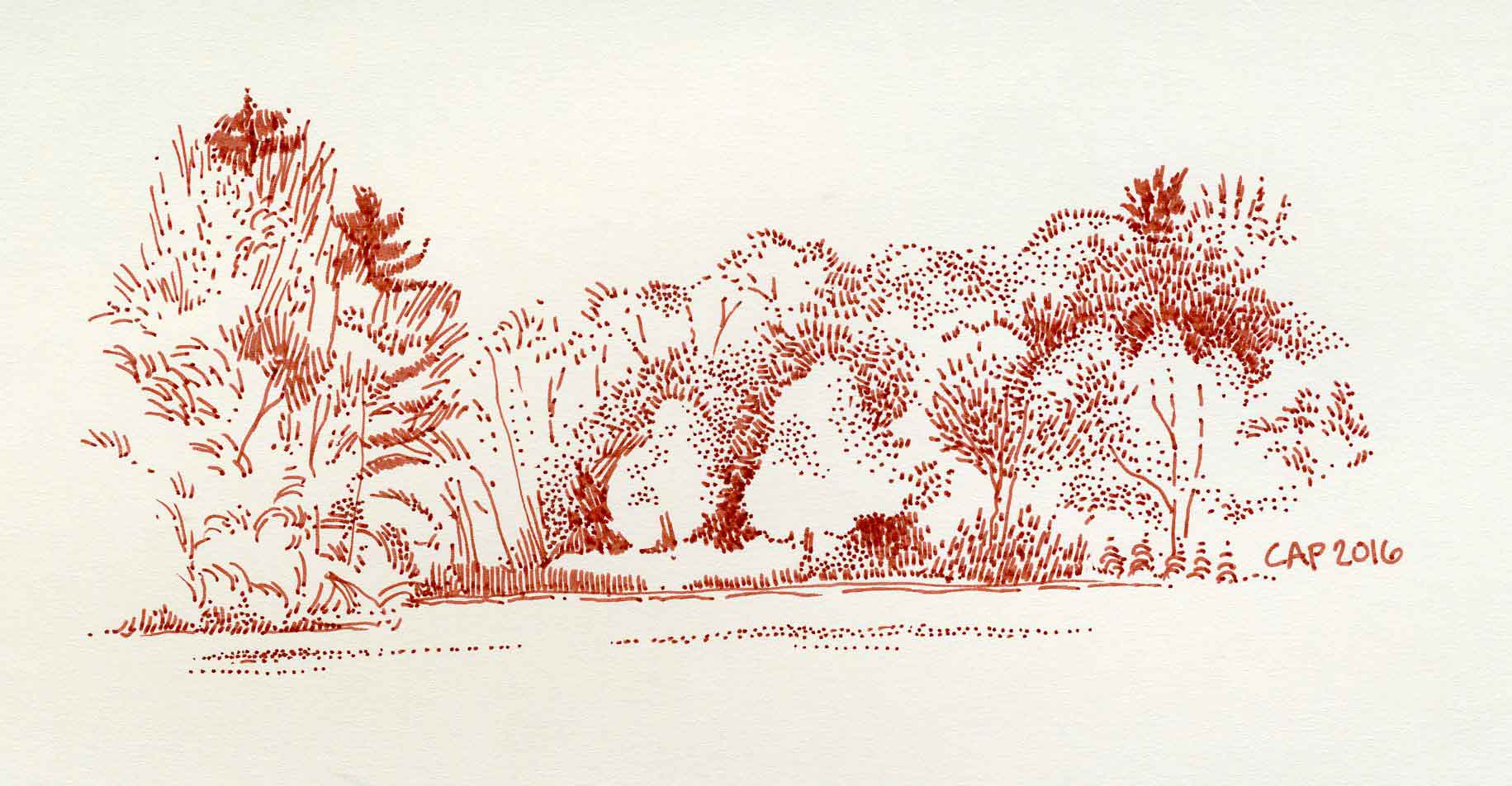
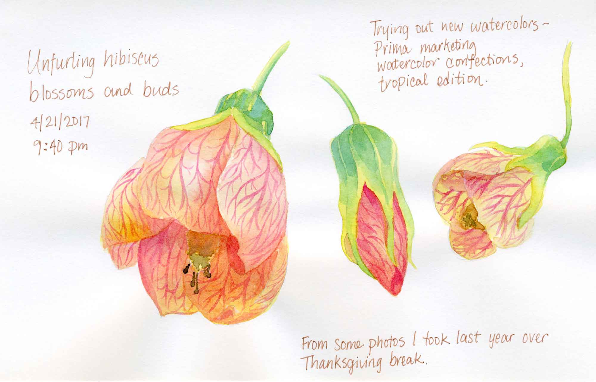
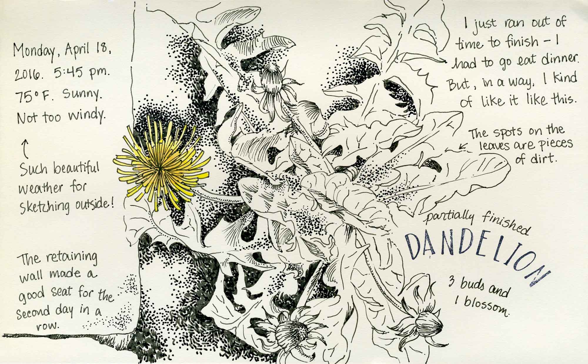
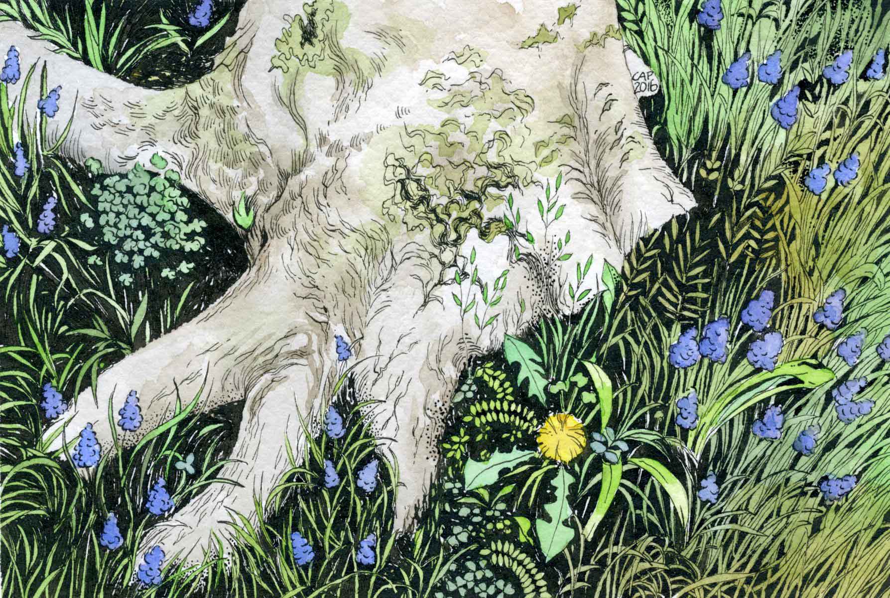
Minimalist Art Supplies

crocus watercolor sketch
©2017 Carolyn A Pappas, Crocus Vernus (5/12/2017). Watercolor and rubber stamps in large moleskine.
A few weeks ago I came across this blog post about how to implement a minimalist strategy with art and crafts supplies. Some of the author’s opinions are a little extreme and I prefer high quality materials even for sketchbook work. That said, so many people out there have a problem with collecting art supplies and she definitely has some good points. I also have realized how much I have veered off track from my minimalist roots. Going through nursing school is tough (I’m halfway done with the program!) and I have definitely used art supply purchases as a reward for getting through school in one piece.

At this point, I have plenty of interesting supplies to play with and I’m going to focus on using them to their full extent. The biggest thing that has helped me maintain control is to decline purchasing supplies that do not relate to my chosen media. Right now I only work in watercolor, pencil, and ink. Until I have a bigger studio space, I have decided not to pursue acrylic, pastel, oils, printmaking, etc. It’s not that I don’t have an interest in experimenting with other media; it’s more of a practical way to stay focused. For the rest of the year, I am going to make a concerted effort to stay out of art supply stores and use up what I have. I do have some new supplies that I have not finished experimenting with yet, so stay tuned for some future blog posts about those.

lake horizon sketch

One Year Ago Today: Nothing to do but Relax

lake horizon sketch
©2016 Carolyn A Pappas, Slow Sketch (5/10/2016). Ink in large moleskine.

What is the good of your stars and trees, your sunrise and the wind, if they do not enter into our daily lives? -E. M. Forster

I’m looking back into my sketchbook from one year ago today. I made this little sketch while sitting on the wall by the shoreline looking out over the lake. The weather was very pleasant and I remember taking my time making the individual marks with the pen. On that day I had no commitments and nothing special to do. It was lovely.

hibiscus sketch

Trying out new paints: Prima Marketing Watercolor Confections

Recently I got an email from a reader asking me what brand of watercolor paint I use. I generally use Winsor & Newton and M. Graham, but I recently purchased a new set of watercolors and spend the last few weeks testing it out. I originally heard about this set on the Artist Journal Workshop facebook group that I am a member of (a great resource for hearing about new supplies).

The watercolors are made by a company called Prima Marketing based out of South Korea. The set comes with 12 half pans in a handsome metal enameled tin with a numbered color chart that fits nicely in the box. There are several sets available: The Classics, Tropicals, Decadent Pies, Shimmering Lights, and Pastel Dreams. I decided to go with Tropicals. Upon reading the reviews, some of the colors in the other sets are metallic so be aware of that.

The paint is advertised as being professional grade, but I beg to differ. The paints are numbered and there is no pigment information listed, which is a red flag. I was able to find this lightfastness chart, but the color names sound more like makeup than paint names (e.g., lilac rain, pool party, etc.) I, like many others, bought the set solely for the tin with the intention if filling it with my own paints later on. The paints are actually not that bad though, and I will definitely use them in my sketchbook, where I am not concerned about lightfastness. I was able to mix all sorts of muted and intense colors. I especially like #16 (avocado) which is a pale yellow green and nice to mix with blue or brown to make some nice earthy greens.

The best thing about this set is the price, which is very reasonable and worth it for the tin alone. This would make a nice gift for a budding child artist or someone just getting introduced to watercolor who was hesitant to spend a lot of money.

I used the paints for the following sketchbook pages. I also included an image of the color chart that came with the set.

hibiscus sketch
©2017 Carolyn A Pappas, Hibiscus Study (4/21/2017). Watercolor (with notes in ink) in large moleskine.

camellia japonica sketch
©2017 Carolyn A Pappas, Camellia japonica (4/27/2017). Ink and watercolor in large moleskine.

prima marketing watercolor
Prima Marketing Tropicals color chart

orange butterfly drawing

Butterflies!

Over Spring Break I delved into my reference photo archive and sketched some butterflies. I have a nice collection of photos, some from the butterfly conservatory and some from outside. I tried to identify the butterflies in the last two sketches but had no luck. I did waste a few hours looking at photos of many beautiful varieties though.

swallowtail butterfly sketch
©2017 Carolyn A Pappas, Swallowtail with Ragged Wings (3/4/2017). Ink and watercolor in large moleskine.

orange butterfly drawing
©2017 Carolyn A Pappas, Orange, black, and white butterfly (3/6/2017). Ink and watercolor in large moleskine.
©2017 Carolyn A Pappas, Watercolor butterfly on leaf (3/8/2017). Watercolor and ink in large moleskine.
tree lined path drawing

Pliny’s Allée

tree lined path drawing
©2017 Carolyn A Pappas, Pliny’s Allée. Copic sepia fineliners and watercolor on blank greeting card, 4 x 6 inches.

The first day of spring is one thing, and the first spring day is another. The difference between them is sometimes as great as a month. ~Henry Van Dyke

It’s actually feeling pretty spring-like today, but there is still snow on the ground. I can’t wait until it is consistently warm and sunny outside.

For this piece, I used my new set of sepia Copic Multiliner Pens. I really do like them and they offer a nice alternative to black. The only downside is that I wish they were just a tad darker and that the nibs were not so fine. I usually gravitate toward the thinnest nib in the set, but for some reason, these pens were especially fine.